Mannesmann Brand
Winner
Excellent Communications Design
Brand Identity

Details
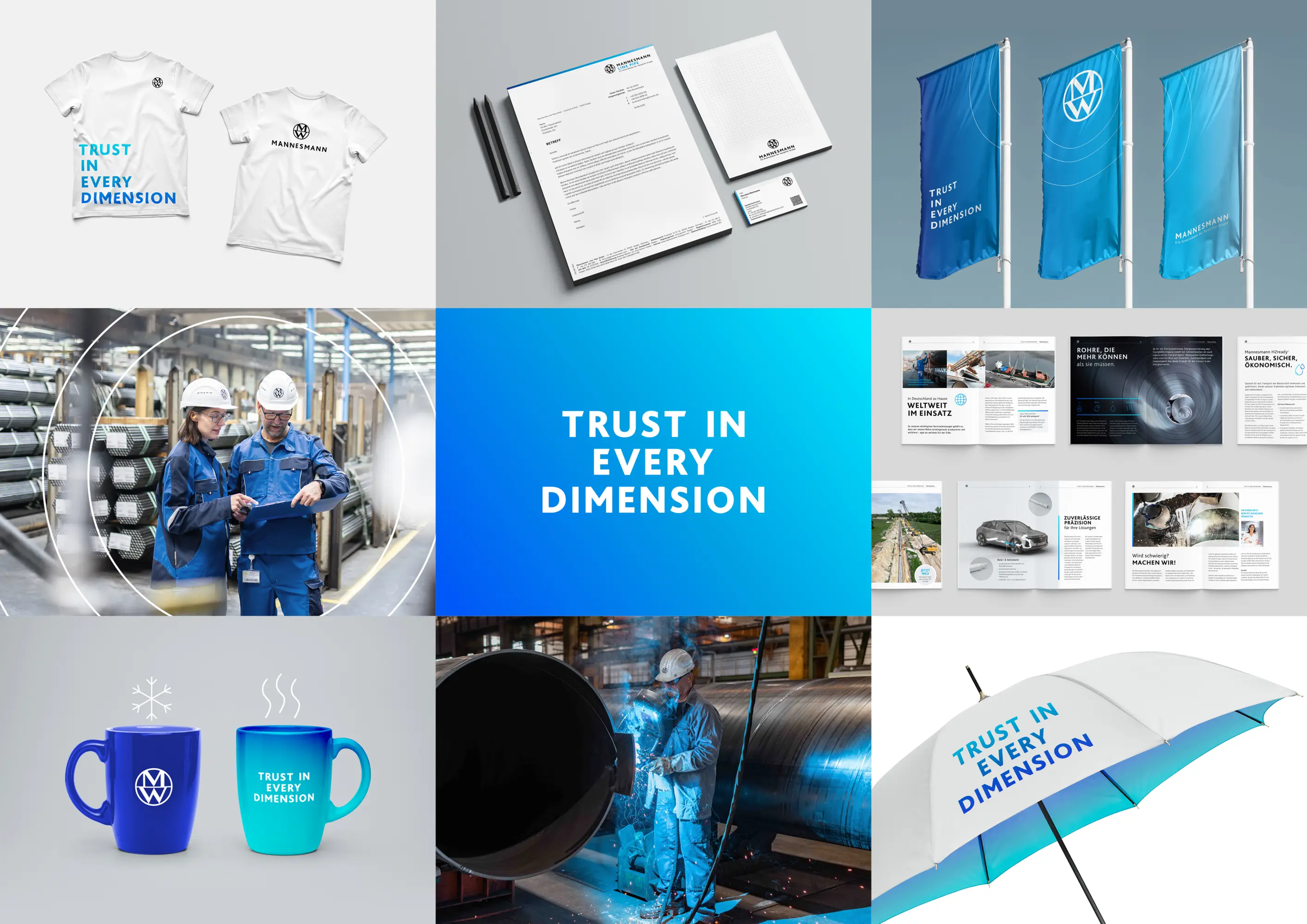
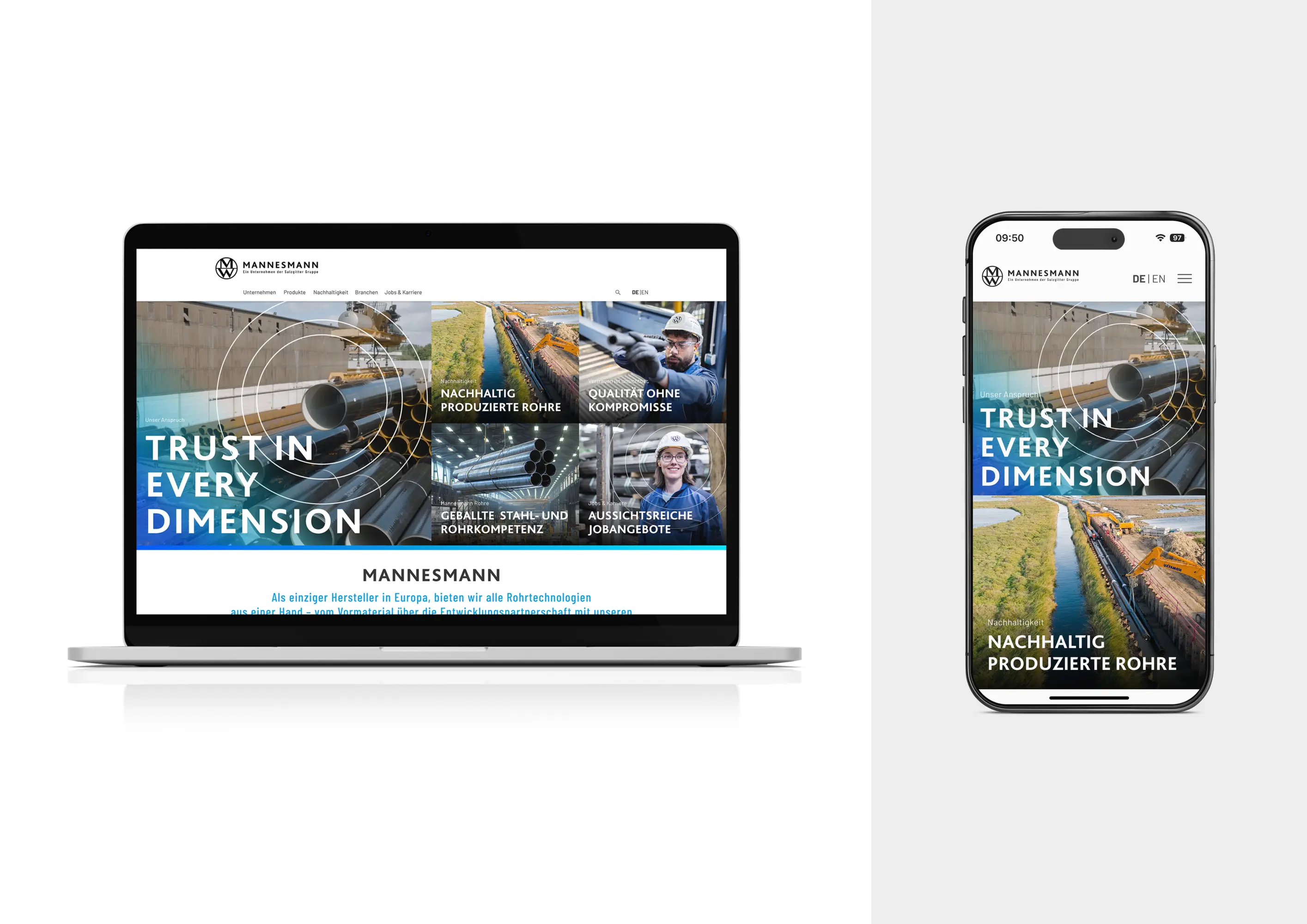
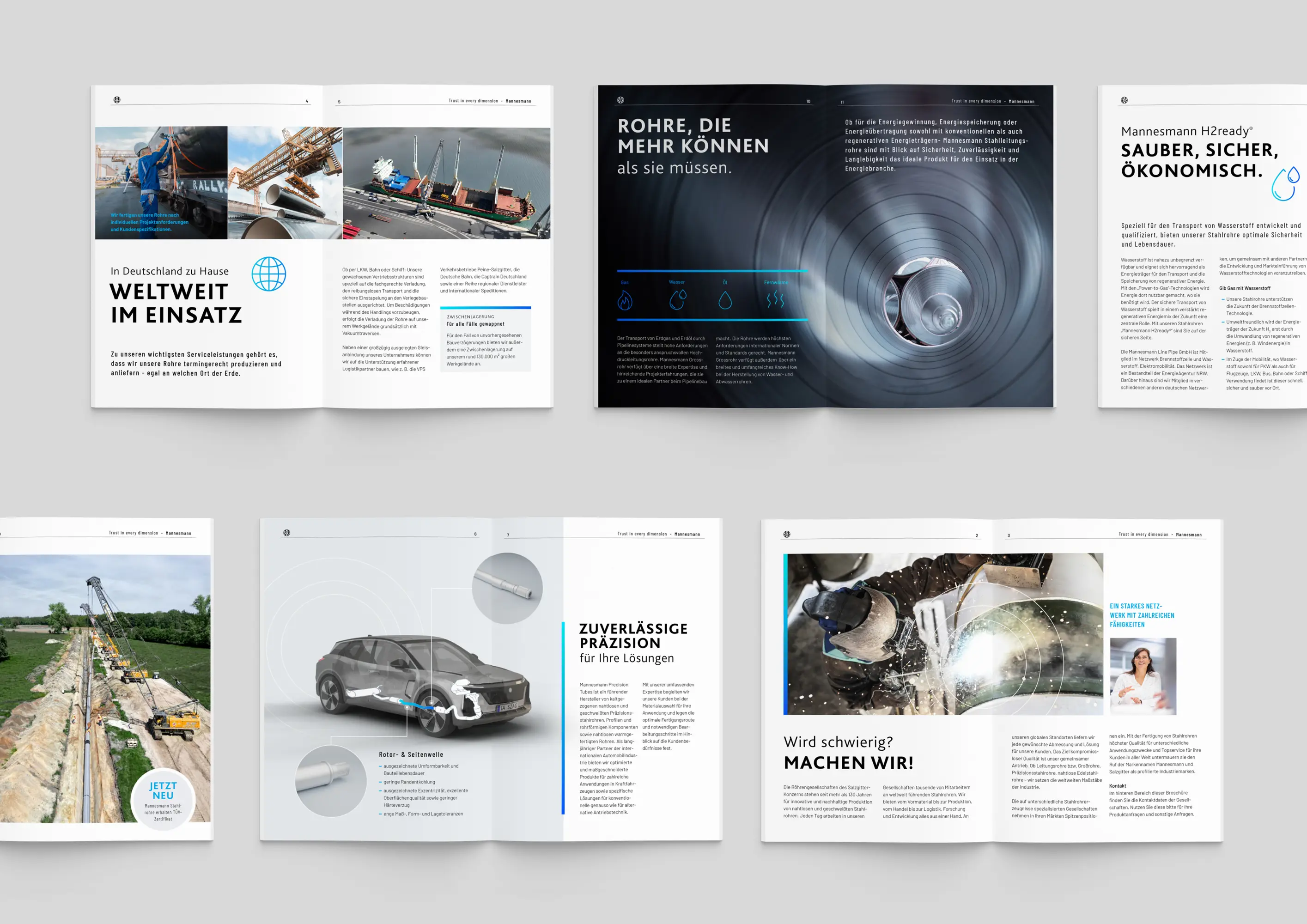
The brand relaunch of Mannesmann creates a future-ready, distinctive corporate identity with a clear, authentic, and engaging tone of voice. The logo anchors people, production, and pipes at its core. The guiding principle “TRUST IN EVERY DIMENSION”, brought to life through an emotional brand story that makes trust both tangible and relatable. Visually, the claim is expressed through three focus rings that lead the viewer´s eye with purpose. A dynamic colour gradient bridges tradition with innovation. Colours, imagery, and design elements form a consistent branding that seamless unites the company, its products, and its subsidiaries across all channels.
The Jury‘s Statement
A clearly designed symbol uniting people, production and pipe characterizes »Mannesmann Brand«. The emotional claim is skillfully translated into three visual impulse rings, creating an expressive link between tradition and future. The coherent color palette, consistent design and authentic tonality turn this branding into an outstanding identity with a distinctive character and high memorability.