Schneider Brand Relaunch
Winner
Excellent Communications Design
Brand Identity
Details
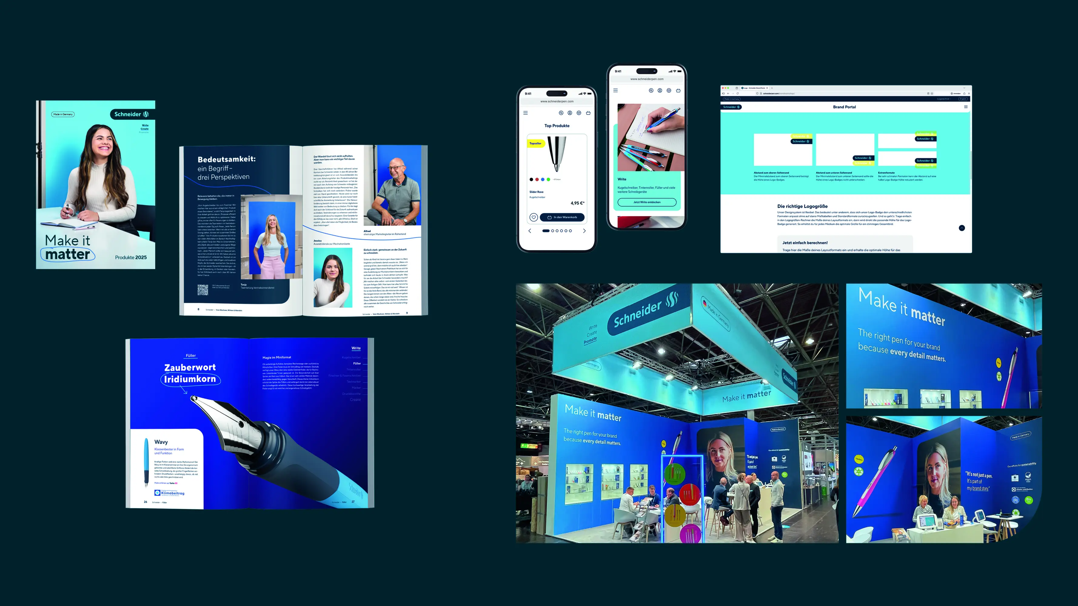
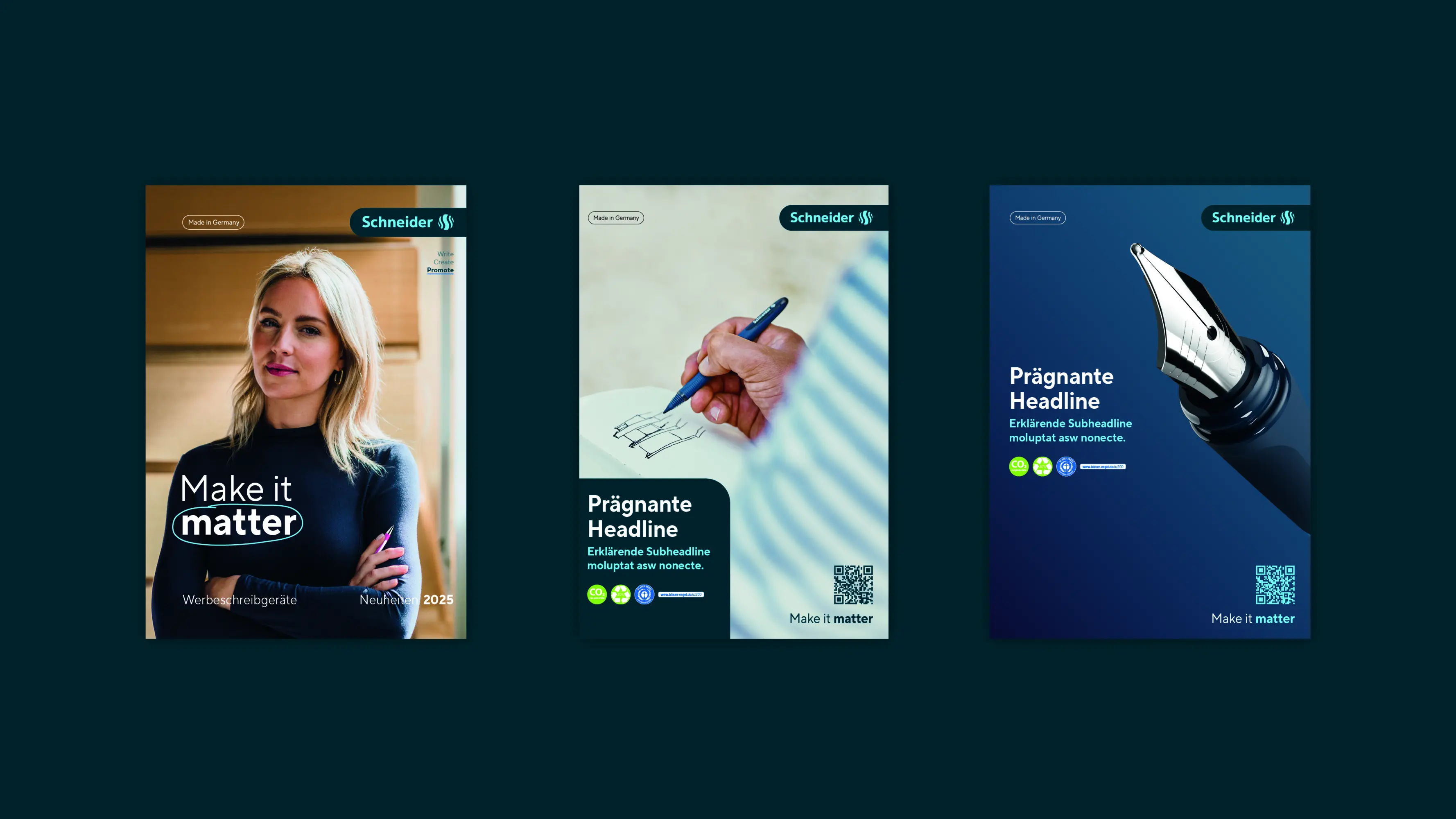
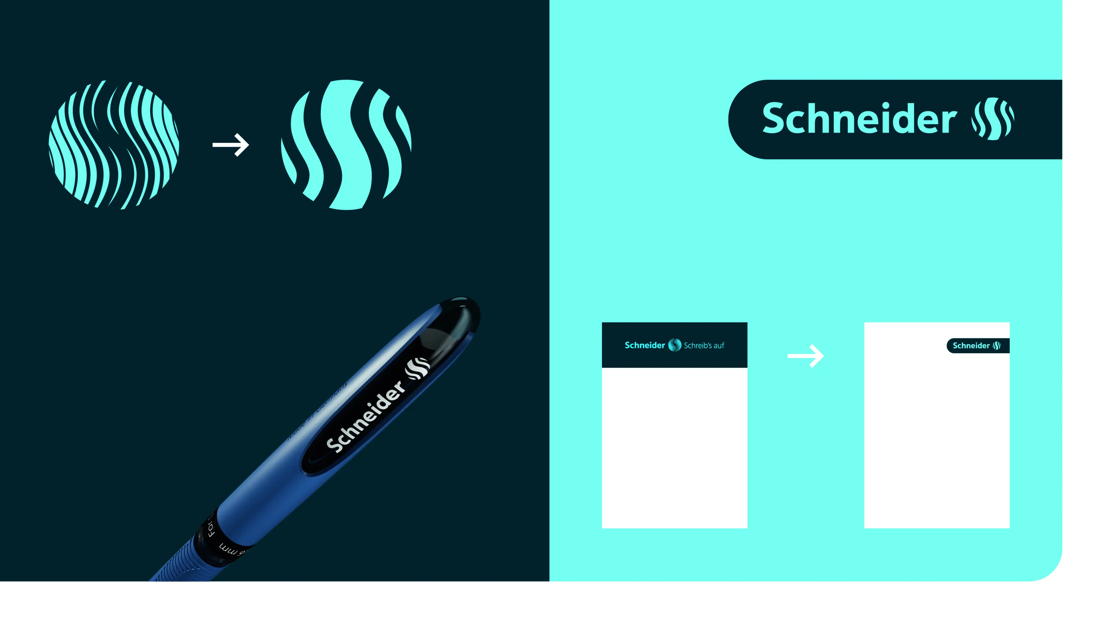
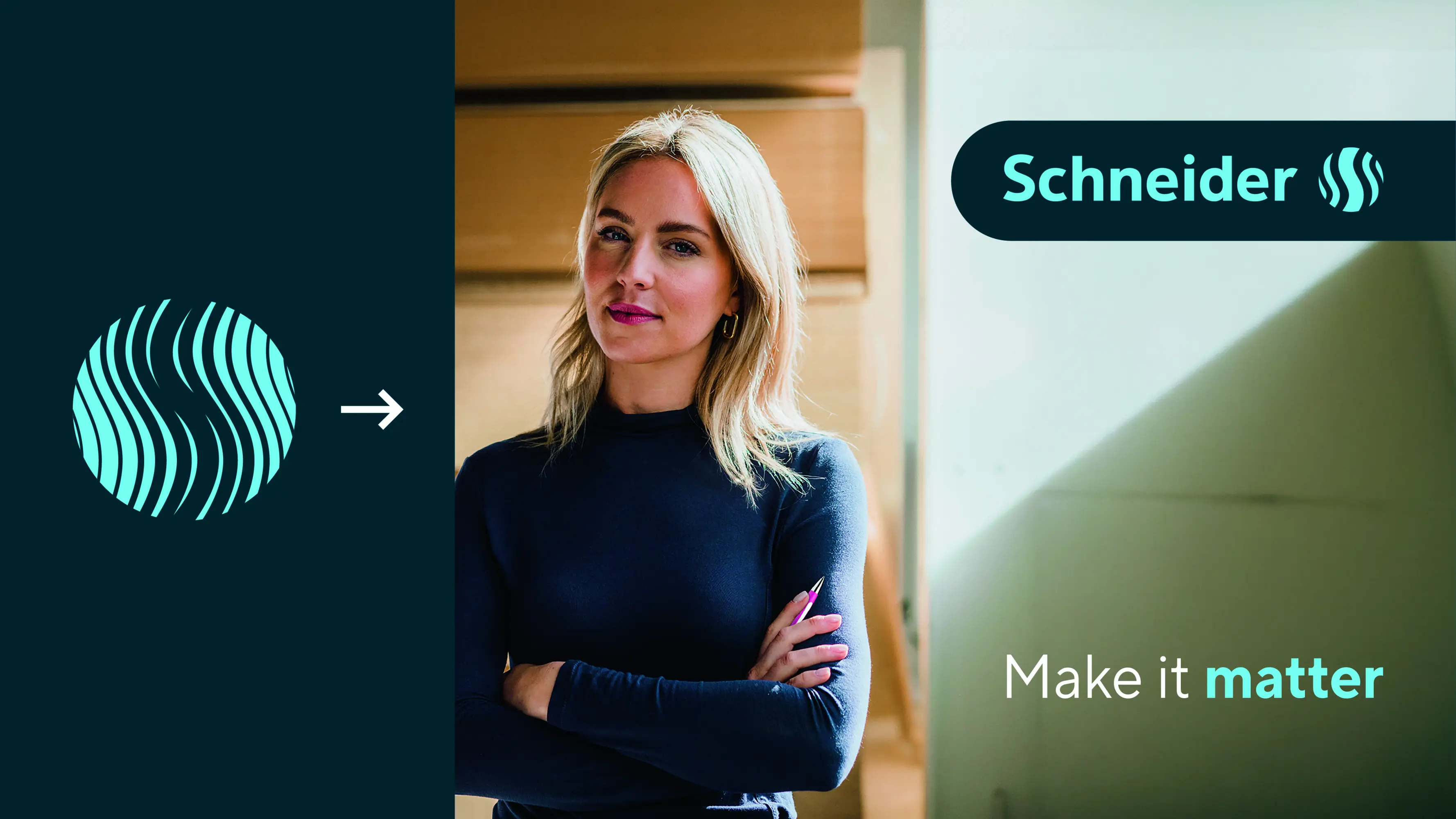
For a long time, the claim 'Write it' defined Schneider. Rethinking led to a new question: Why write something down? Because it matters. This is captured in the new claim 'Make it matter': the emotional value of writing is now the focus. Significance shapes the entire brand communication. The logo and brand elements have been modernized, digital applications simplified. The new logo is more minimal, works better in small sizes, and is flexible in use. The refreshed colour palette, a distinctive new corporate typeface, and a versatile design system now ensure a consistent and impactful presence across all media.
The Jury‘s Statement
The realignment of the claim places a powerful focus on the emotional value of writing. »Schneider Brand Relaunch« impresses with a clearly structured, distinctive design that creates strong recognition through the modernization of logo, colors and typography. The flexibly applicable design system combines aesthetics and functionality in an impressive way. The consistent implementation across all touchpoints is particularly outstanding.