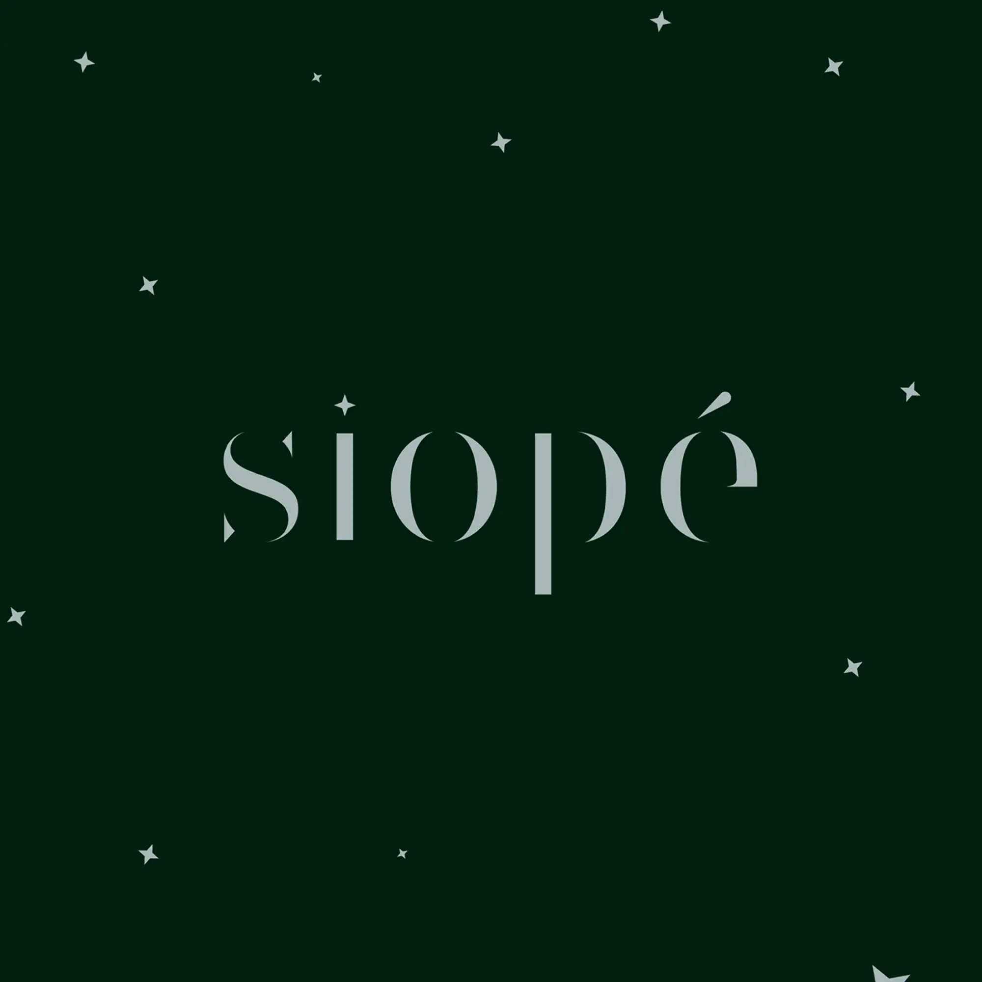
Siope
Winner
Excellent Communications Design
Brand Identity
Credits
Company / Customer
Details
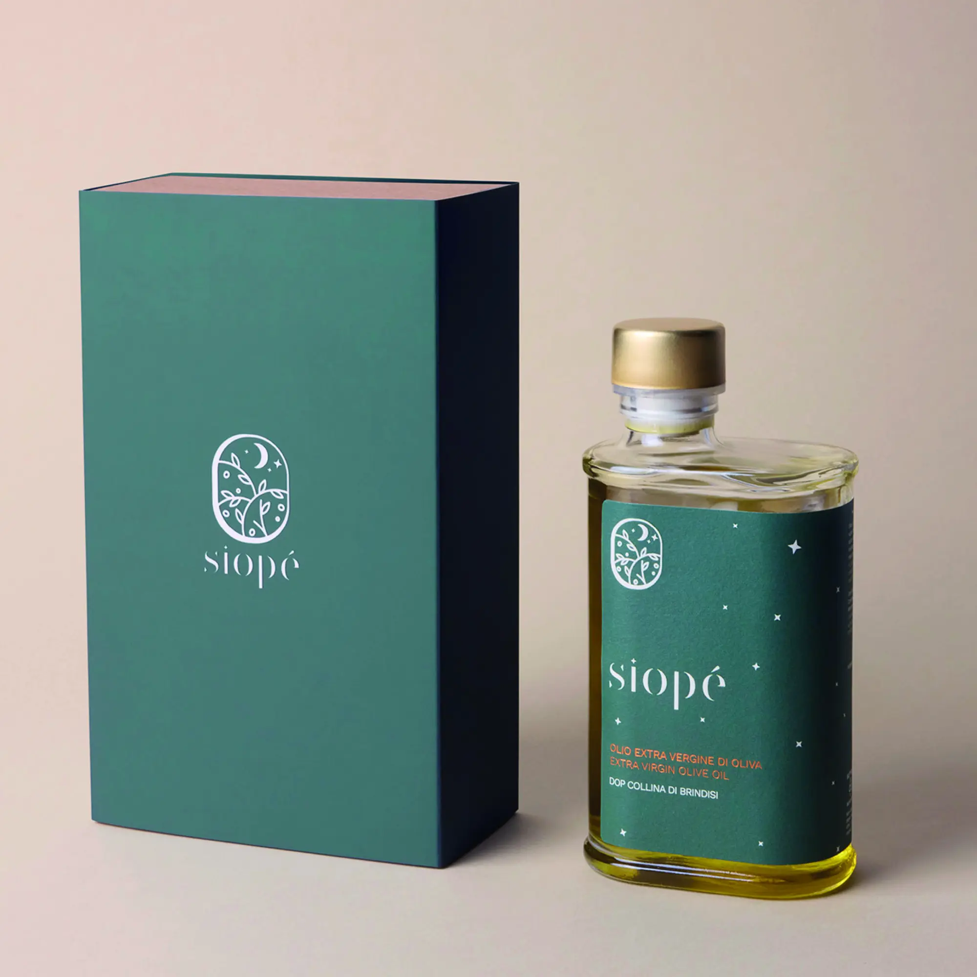
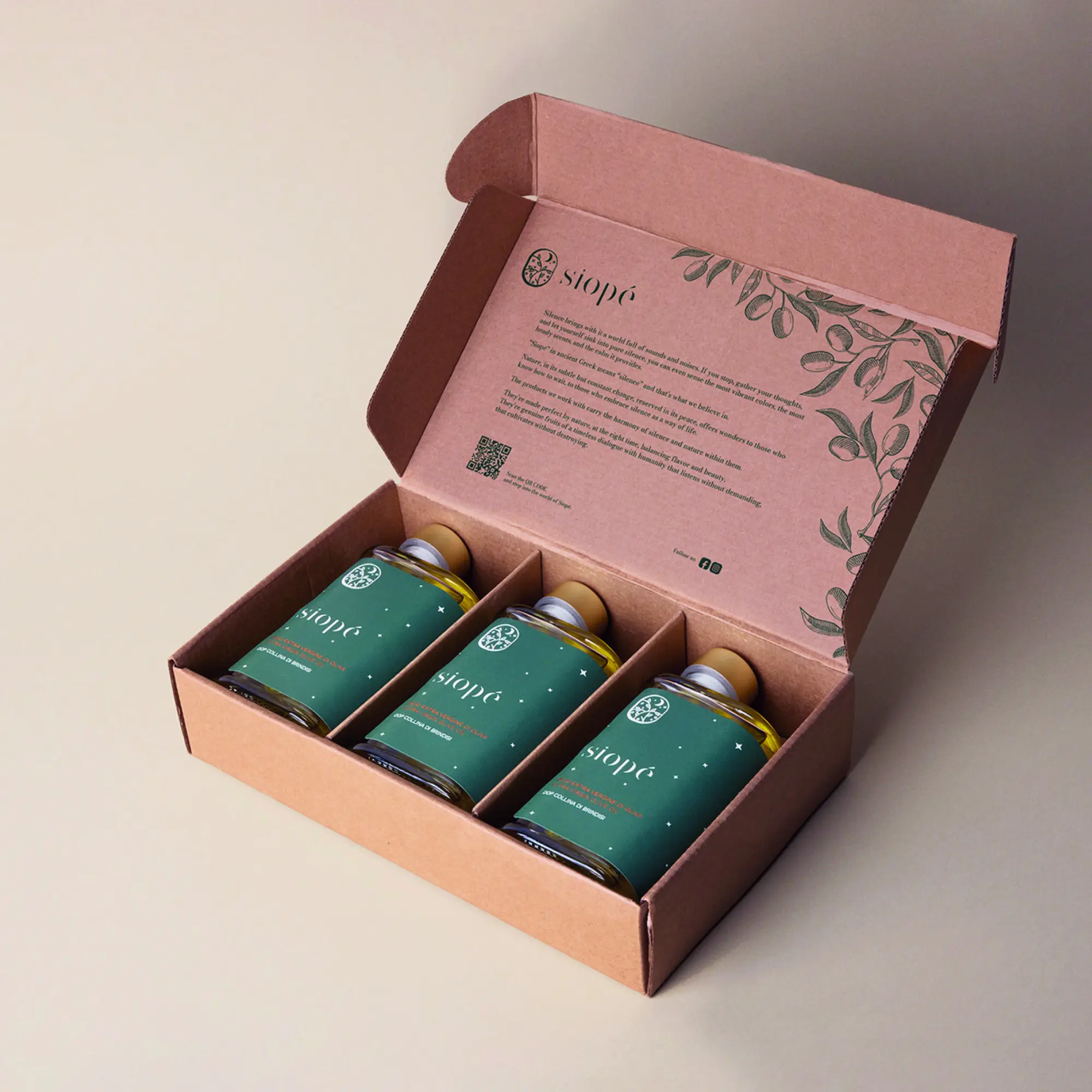
From Ancient Greek, Siope literally means silence. The project aims to interpret the slow passage of time and the austere silence of nature, transforming them into gastronomic and cosmetic products that enhance their most intimate value. The production cycle is based on respecting the plant's lifecycle, using everything it provides to avoid generating further waste.
The Jury‘s Statement
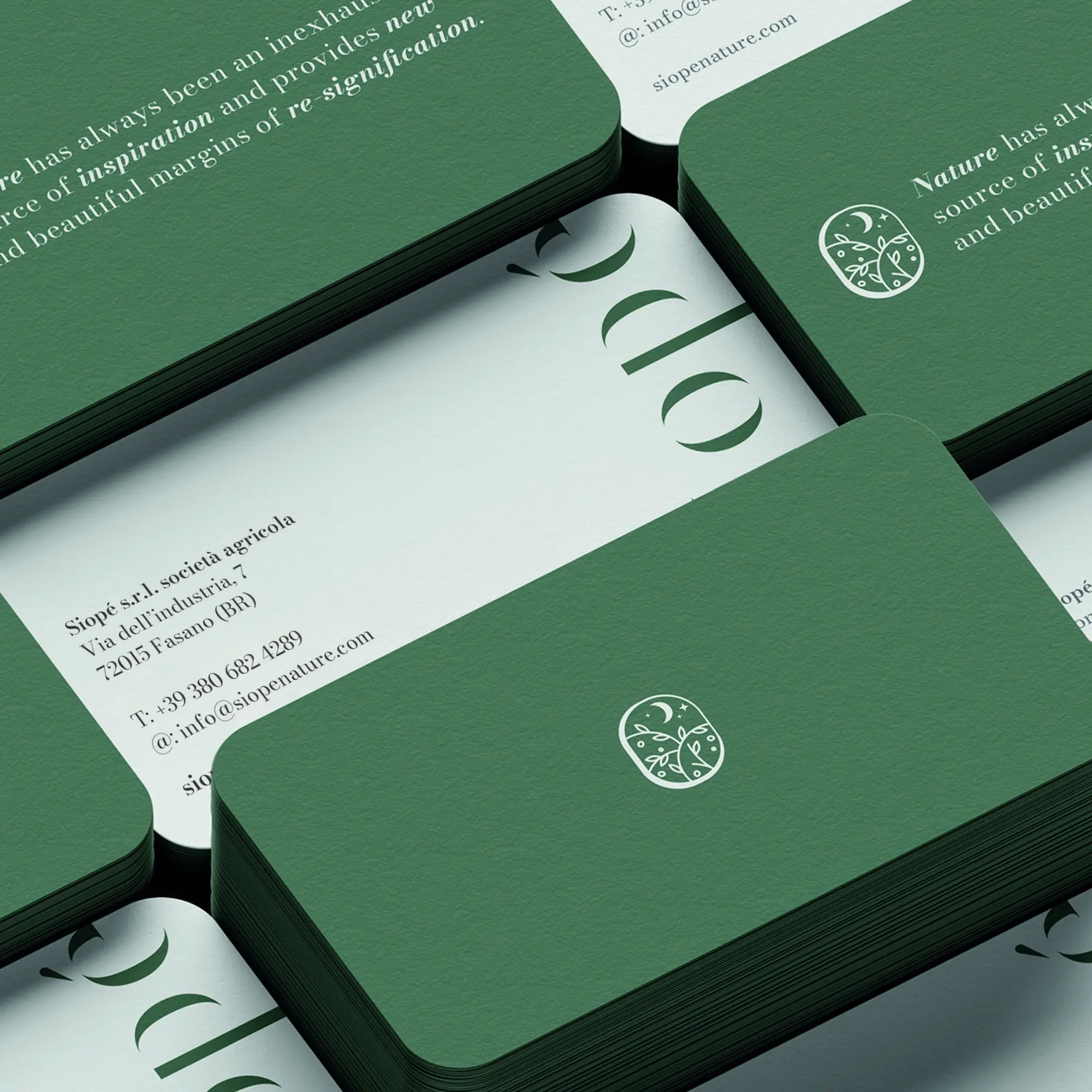
Quiet conciseness defines »Siope« and translates the theme of silence into a consistently reduced brand identity. The minimalist logo as a peephole into a nocturnal landscape and the clear typography create a subtle yet distinctive visual language. The combination of a sustainable approach and aesthetic clarity is thoroughly convincing. Its harmonious balance of depth, timelessness, and powerful presence makes it truly worthy of gold.