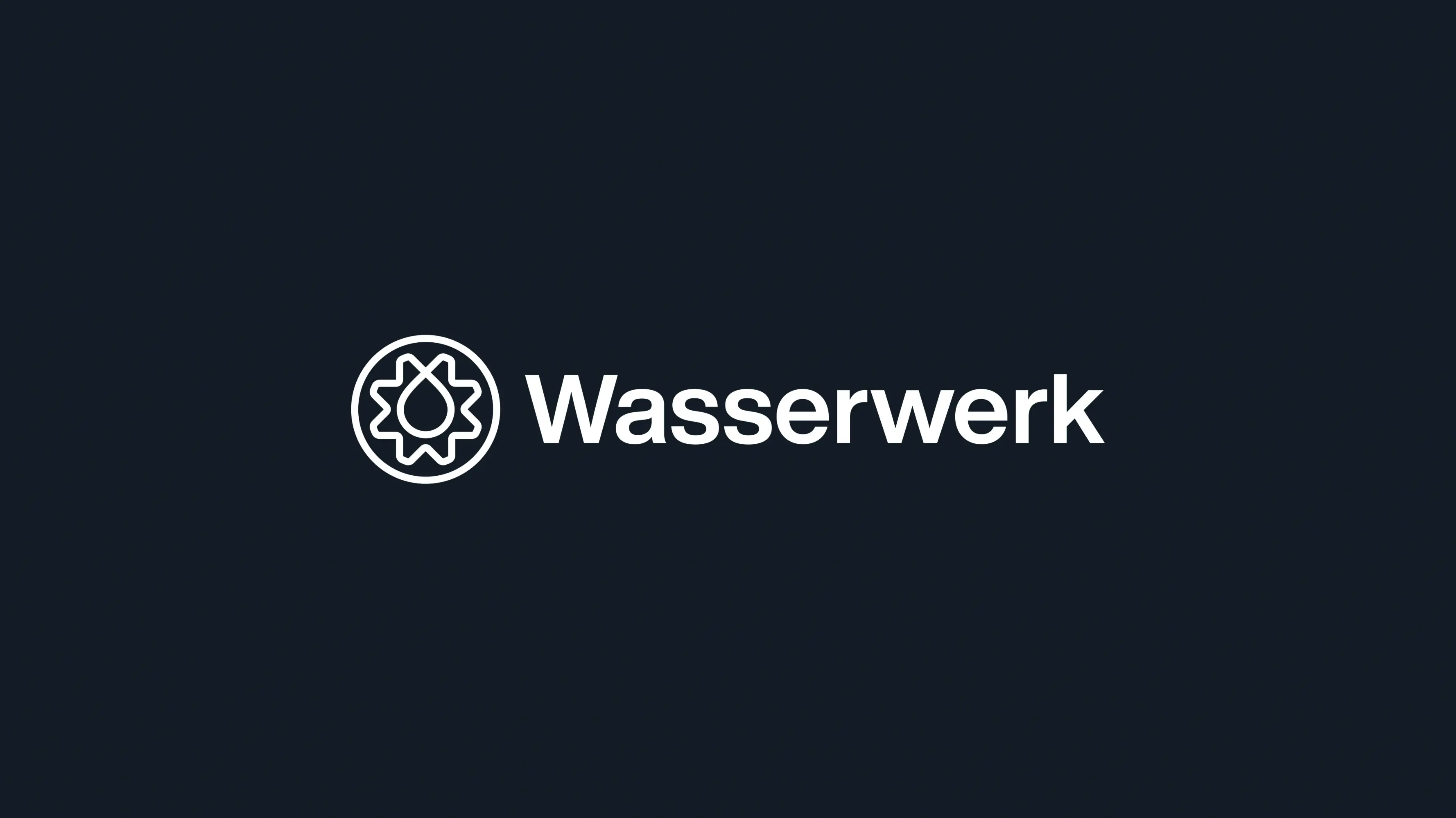
Wasserwerk
Winner
Excellent Communications Design
Brand Identity
Details
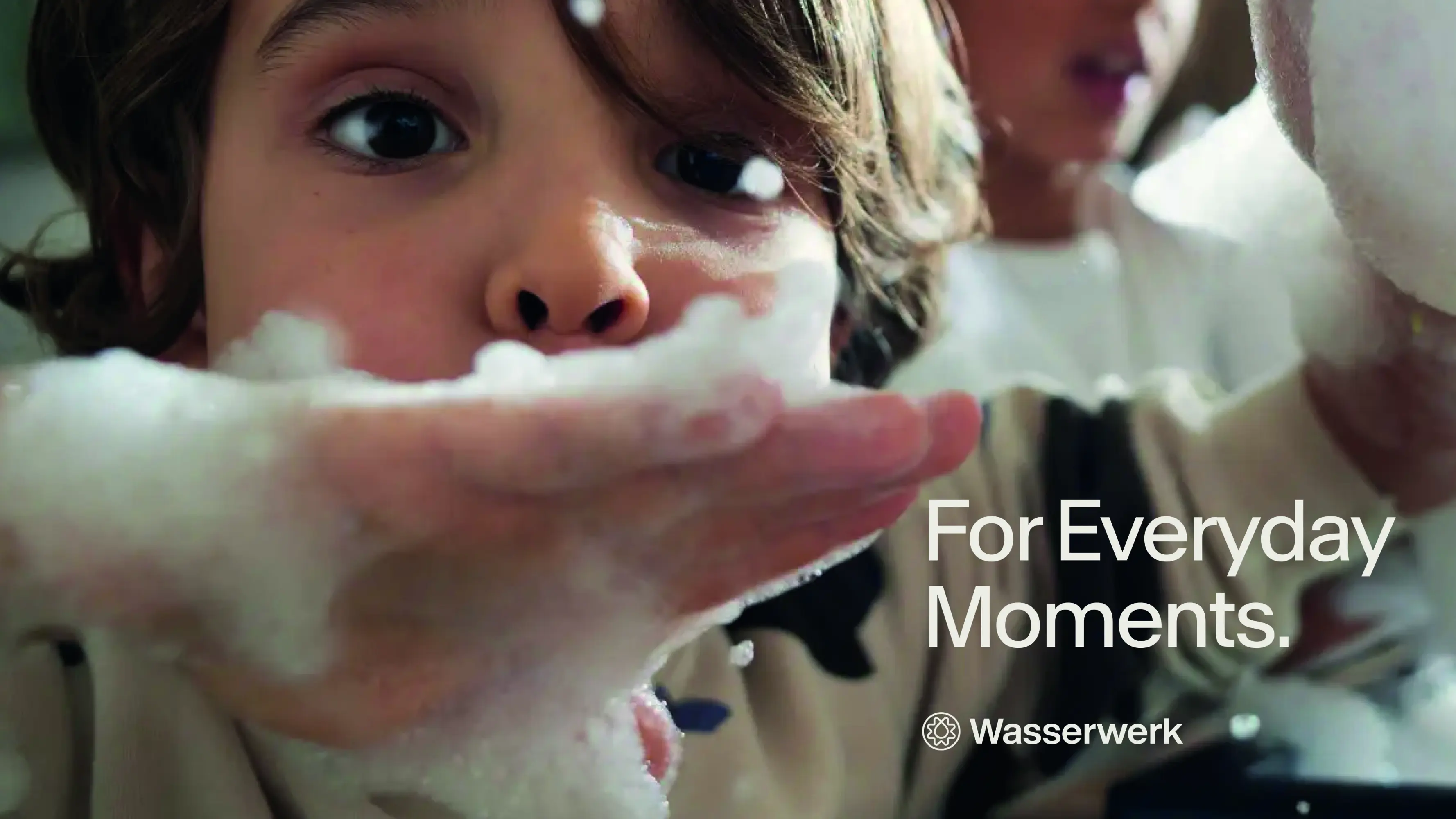
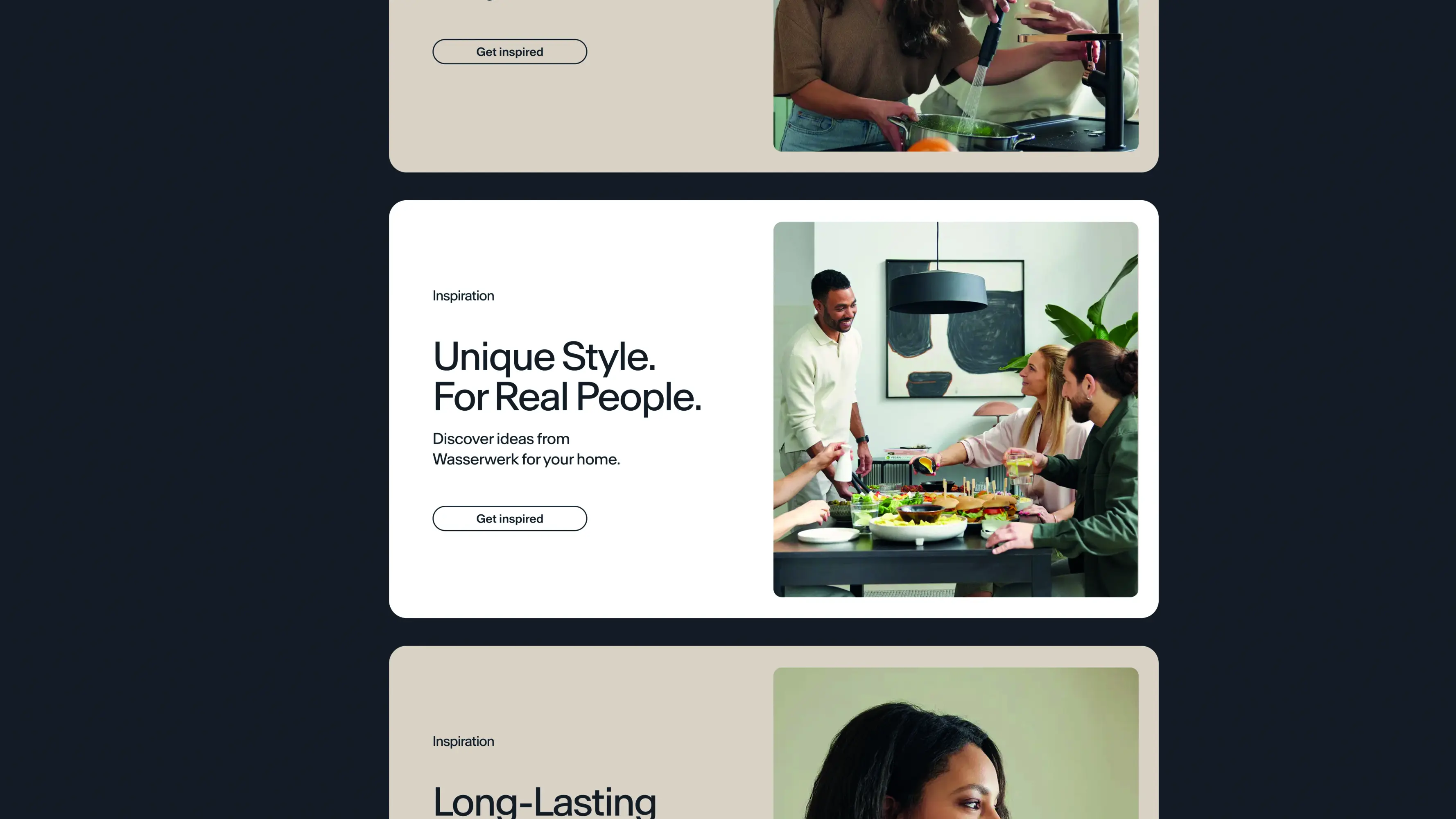
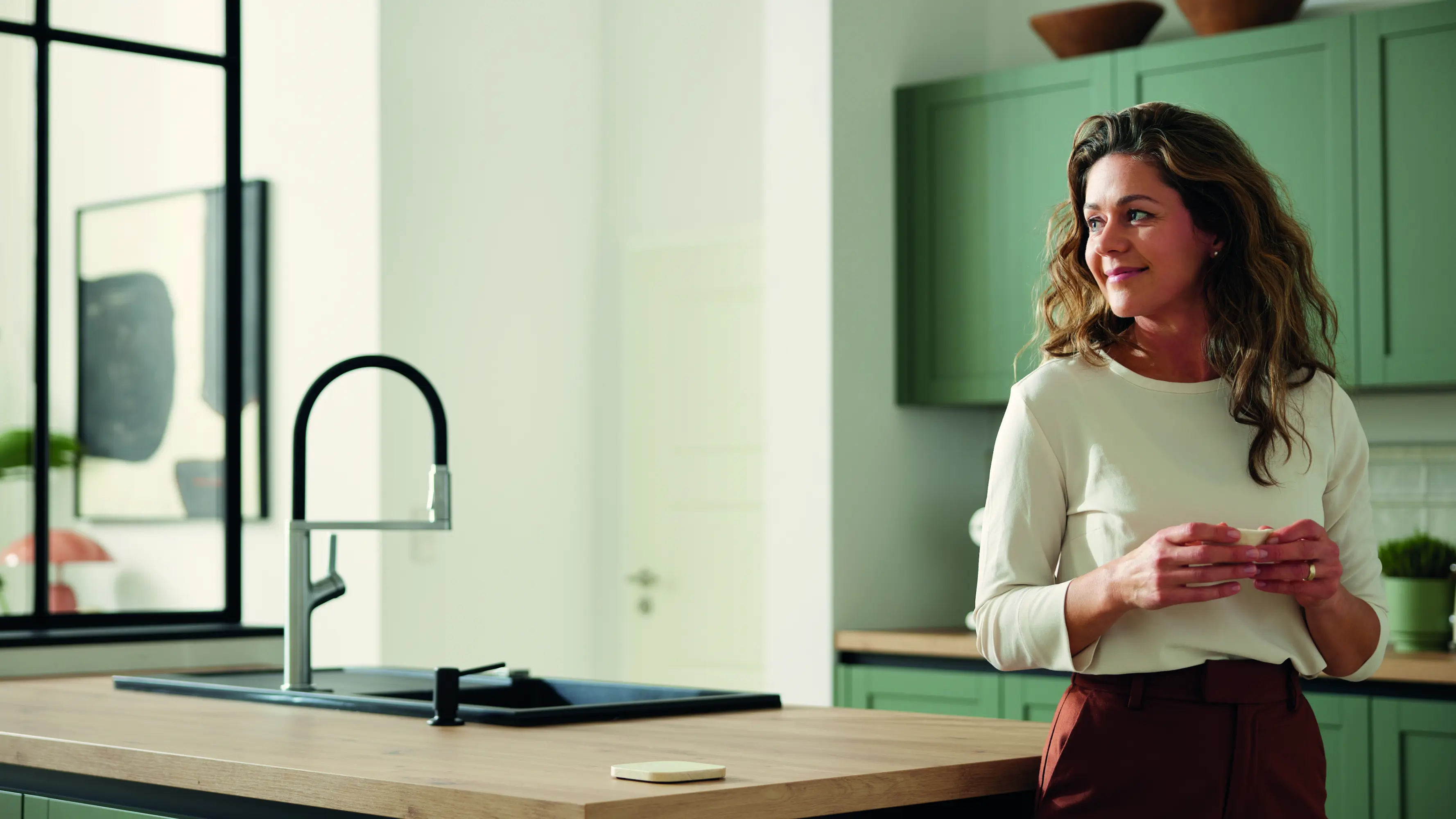
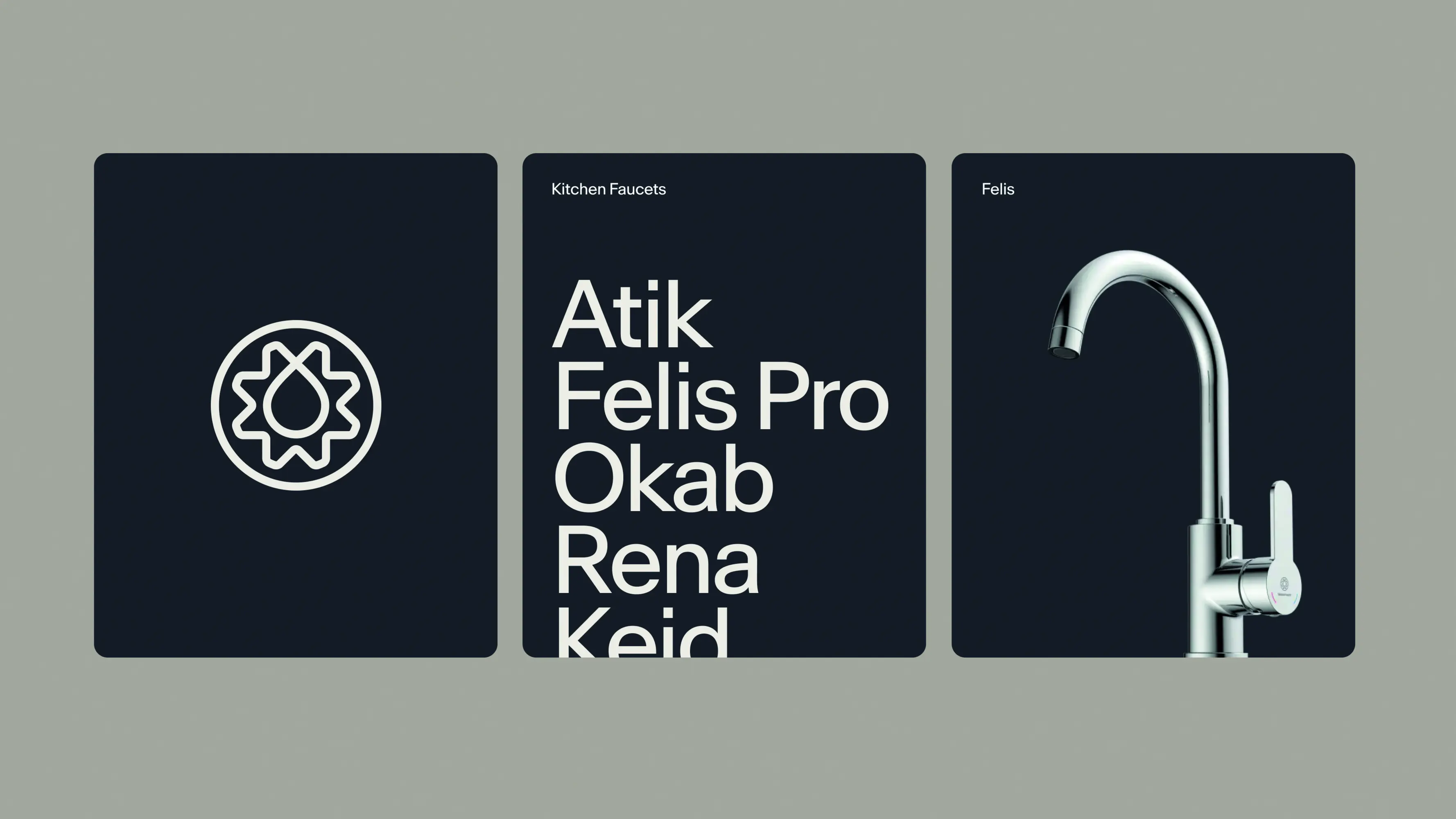
For Wasserwerk, we created a rebranding that unites clarity and humanity. The redesigned signet combines the metaphor of water and werk into a distinctive symbol. The imagery places the family at the centre – authentic, approachable, and trustworthy. Natural scenes and portraits convey closeness, while a fresh colour palette and reduced design language strengthen the identity. The result is a contemporary branding that clearly communicates the values of trust, community, and quality.
The Jury‘s Statement
The fusion of clarity and humanity defines »Wasserwerk« in an impressive way. The distinctive symbol unites water and work into an iconic mark, while authentic imagery conveys closeness and trust. Fresh colors and a reduced design language create an unmistakable visual identity. With its consistency and relevance, this brand identity sets a benchmark for excellent communication design at Gold level.