Brand Identity of Incheon Islands
Winner
Excellent Communications Design
Brand Identity
Details
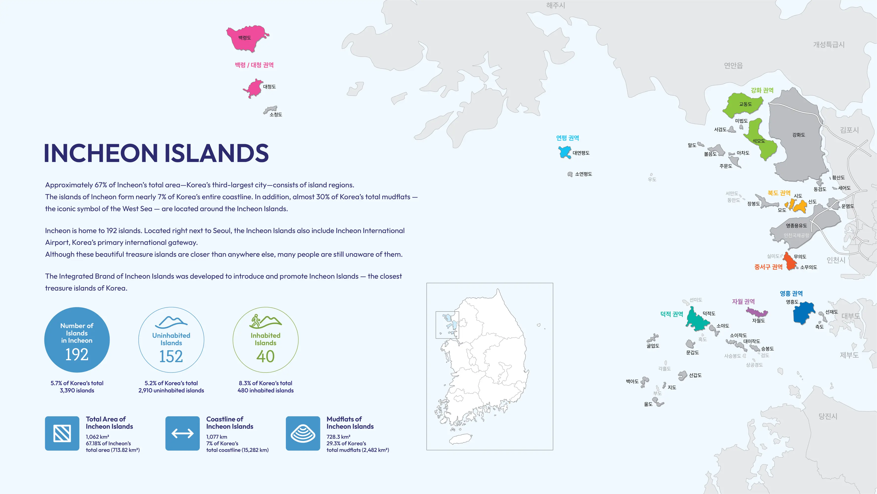
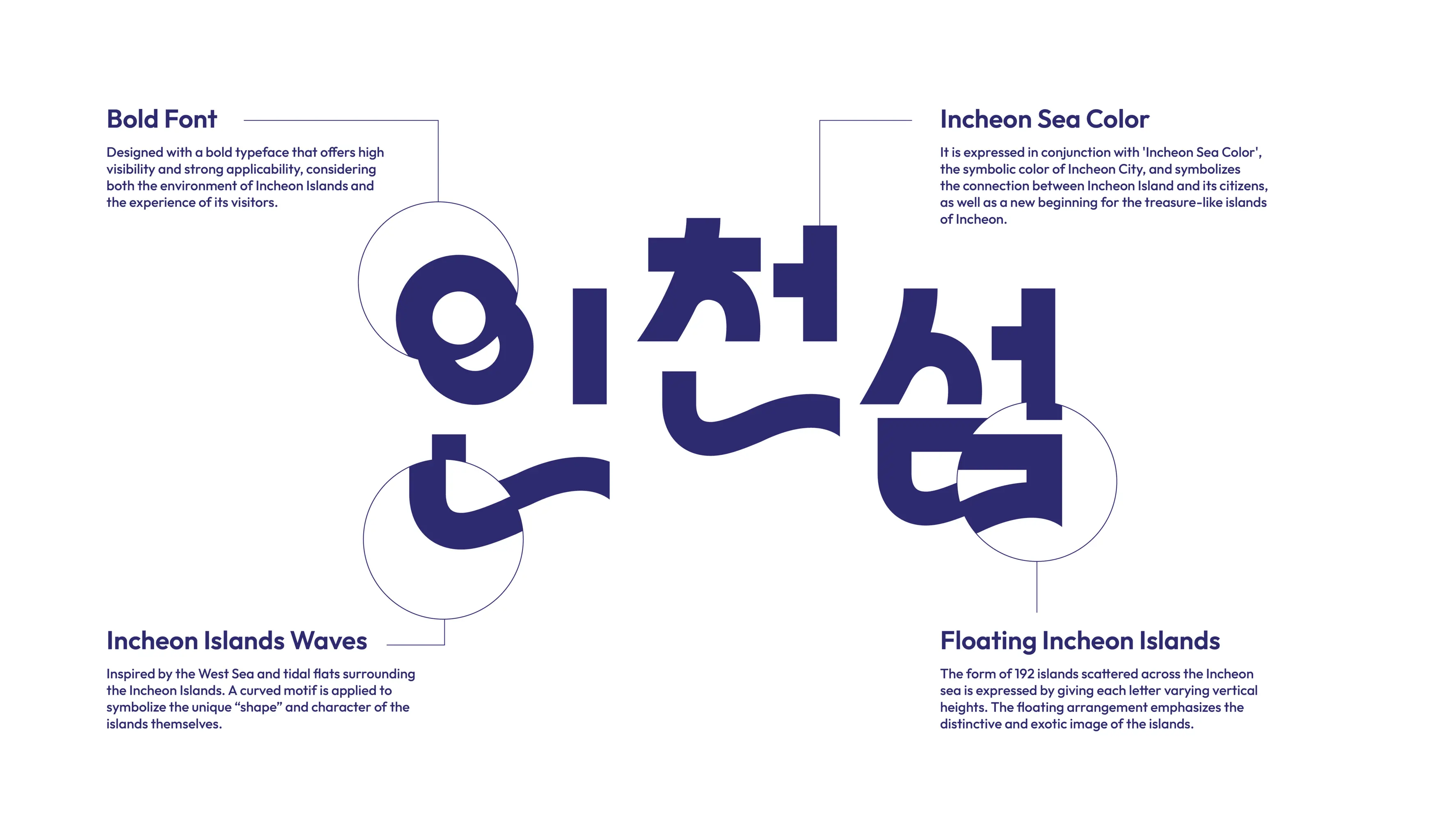
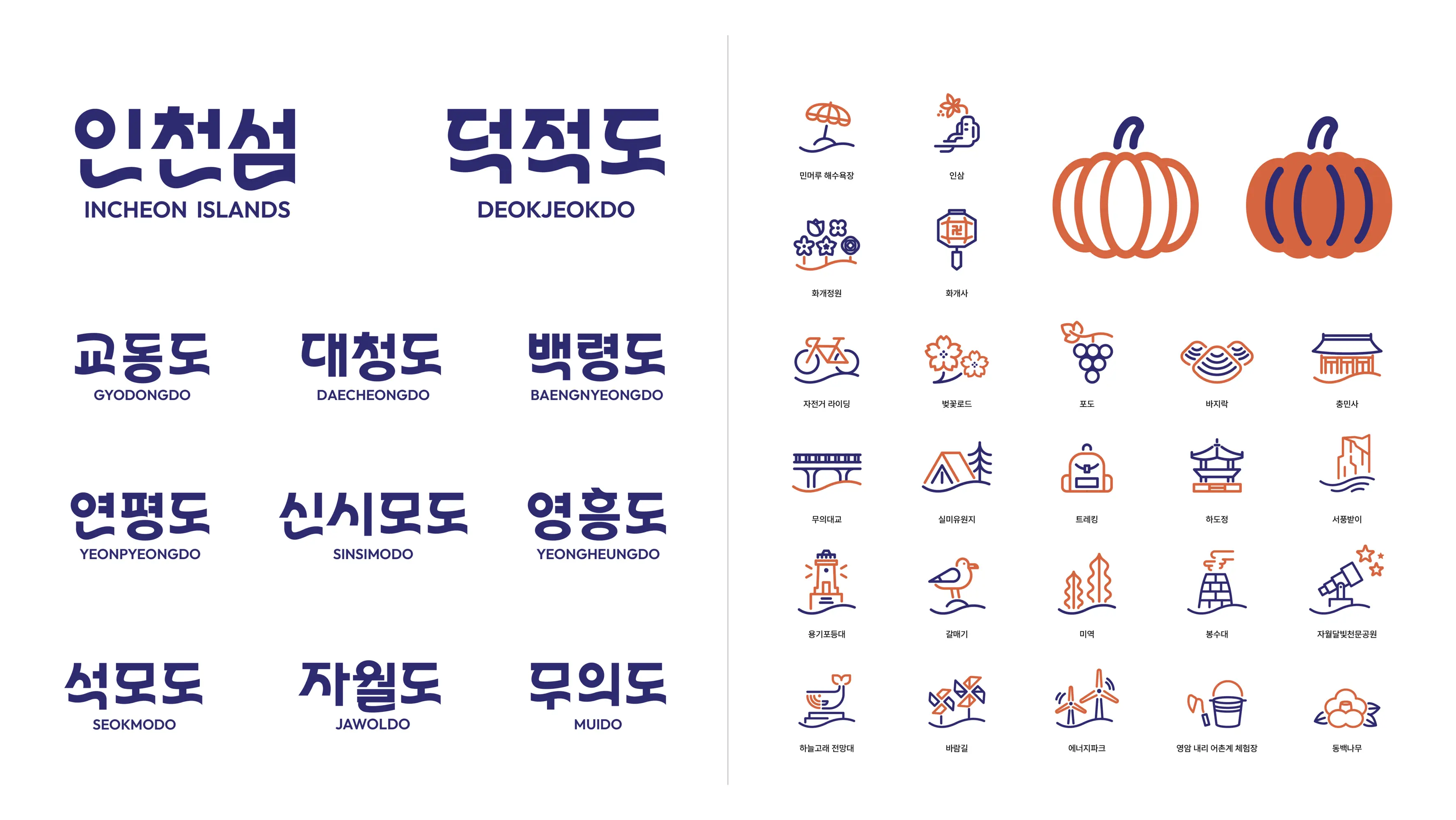
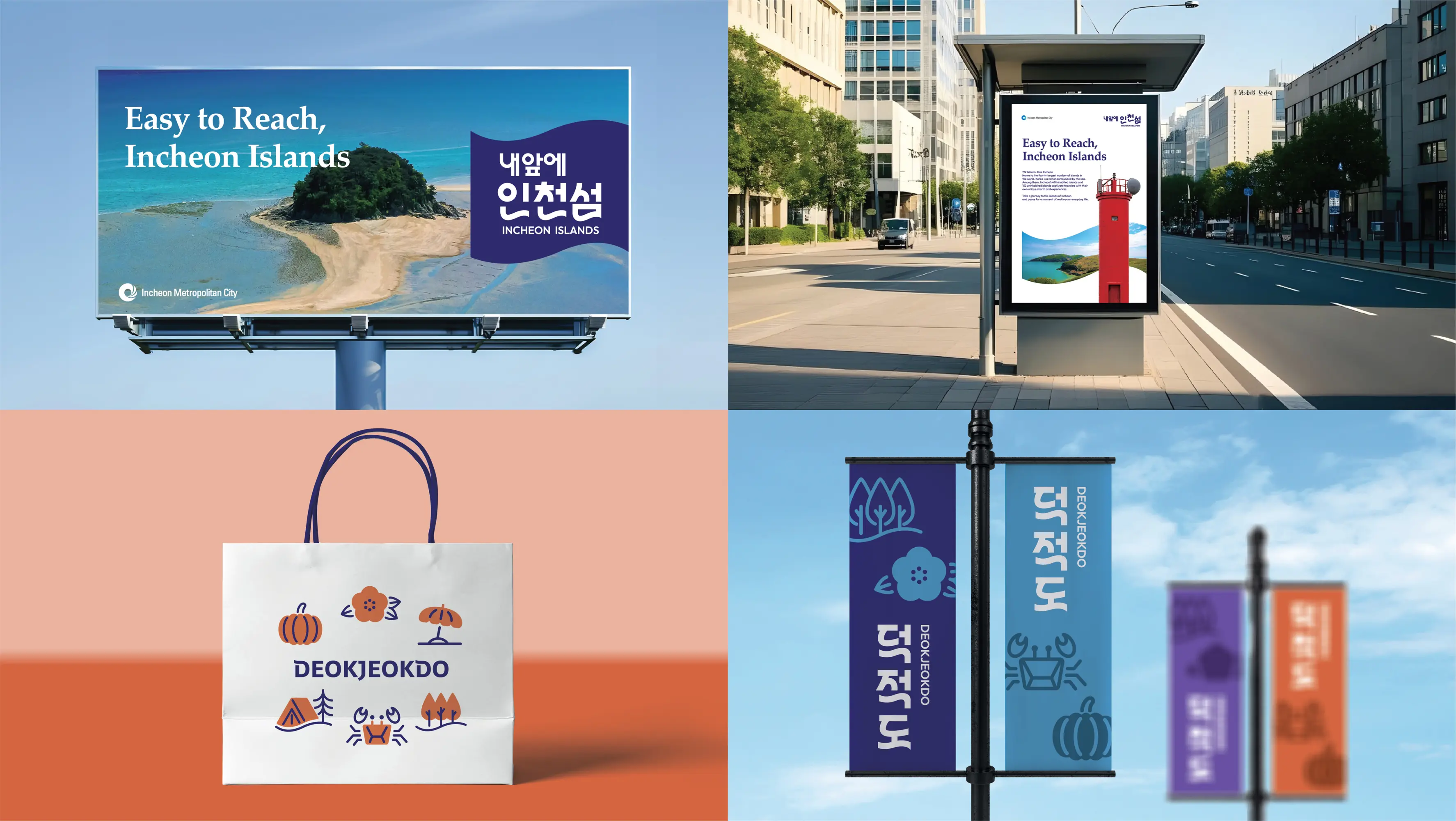
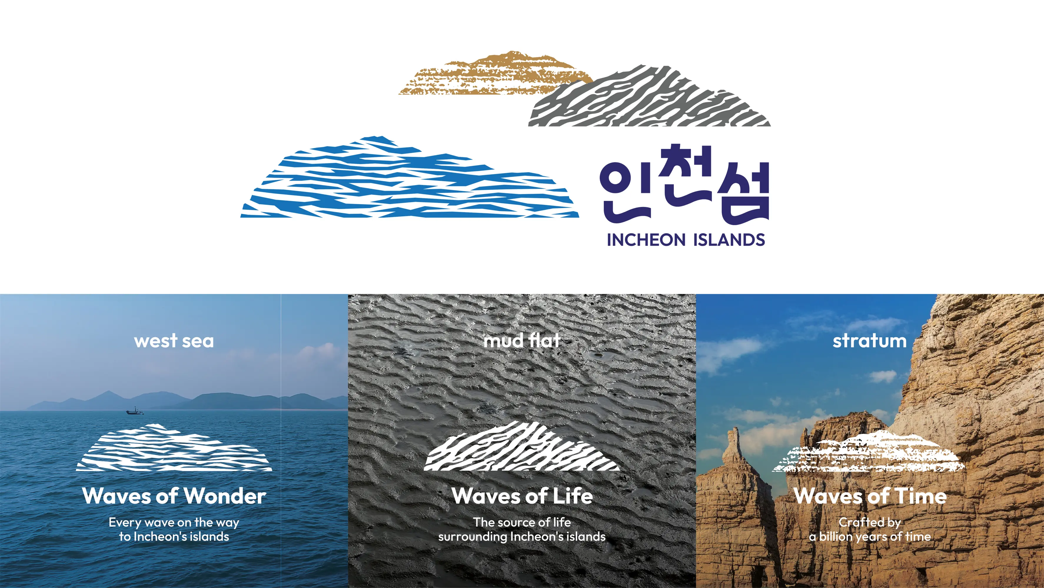
The “Incheon Islands” brand was developed to increase awareness of Incheon’s 192 islands. The logo was designed as a wordmark to make the brand name instantly recognizable. The wave motif integrated into the lettering symbolizes the West Sea surrounding the islands, while the varying heights of the letterforms represent the islands scattered across the sea. In addition, the sea, mud flats, and geological strata of the islands were used as motifs and expanded into various brand elements.