eletopia : Neo Energy
Winner
Excellent Communications Design
Brand Identity
Credits
Company / Customer
Designer
Details
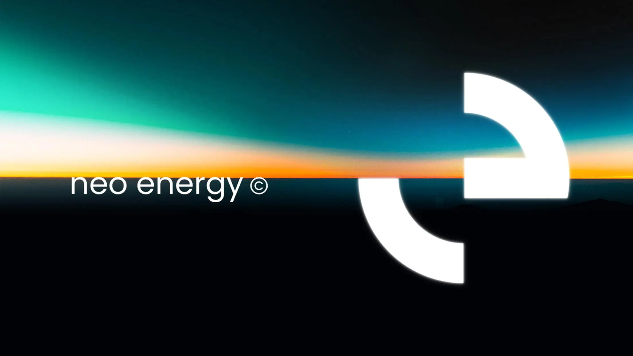
eletopia is committed to the field of smart energy storage, hoping to create an example for society using electricity freely and smartly. We expressed the brand with an intuitive, concise and efficient design language. Using brand "e" as the basis of visual symbols, we illustrated the relationship between positive and negative shapes and visual inertia: and a sense of fluidity was created. It is not just a simple geometric symbol, but also reflects the hopes of a circular momentum.
The Jury‘s Statement
The idea of representing the positive and negative charge of electricity through a circular shape consisting of visible and invisible elements is ingenious. The graphic appearance of the eletopia lettering, which is derived from a round geometric design language, thus appears distinctly modern and progressively oriented towards the future, whereby the open "e" not only makes the lettering unmistakable, but also functions very well as a logo in its own right.