Hunguest Hotels
Winner
Excellent Communications Design
Brand Identity
Details
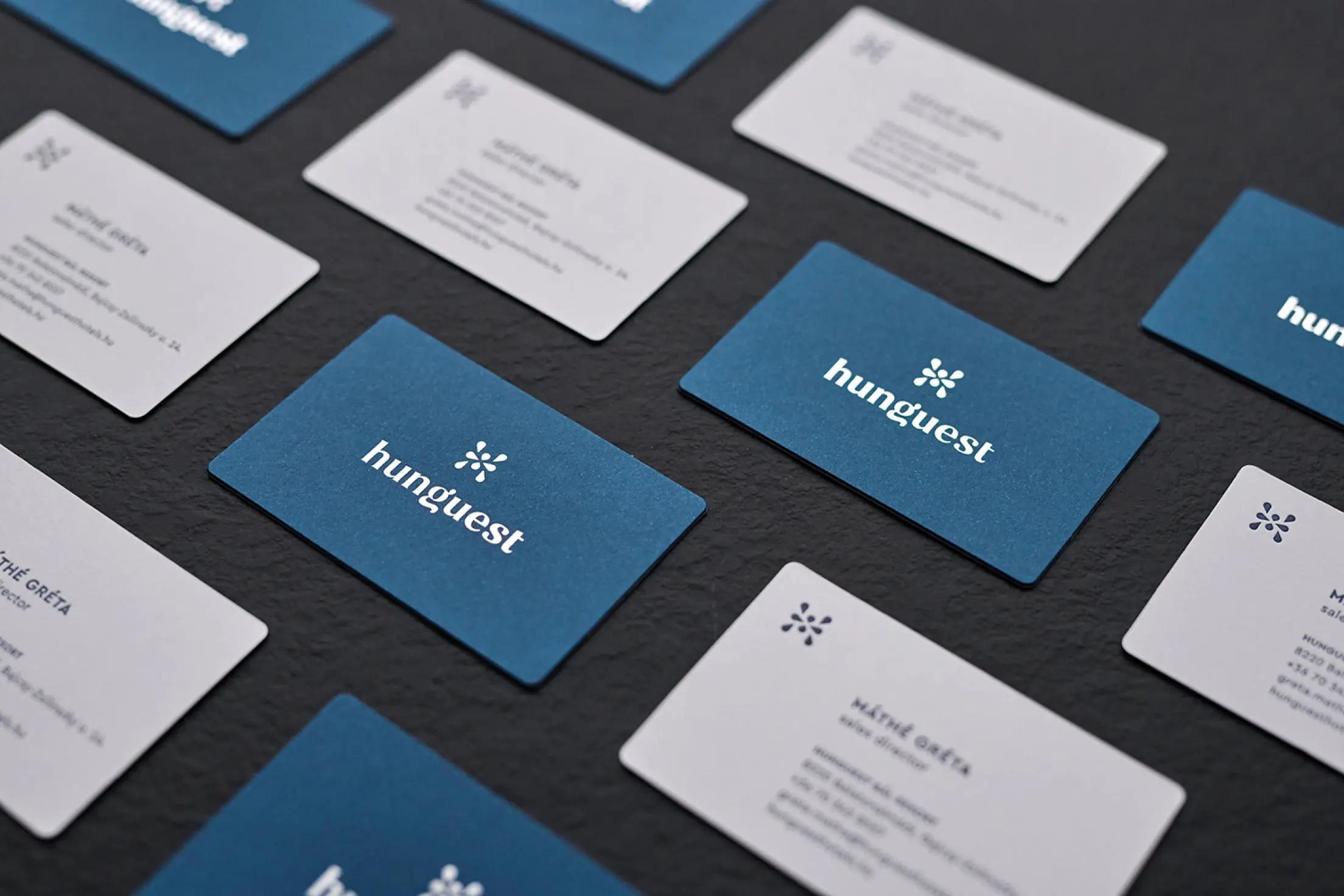
Through their new brand design, Hunguest wanted to communicate their commitment to quality and consistency. Creating this new identity involved redesigning the existing Hunguest logo as well as all the visual aspects, from the hotel signages to the printed materials. Since many of the Hunguest hotels are connected with spa and wellness centres, it was important to show the connection with water: the logo is a capital “H” made up of drops of water.
The Jury‘s Statement
The "H", made of stylised water drops, elegantly refers to the hotel brand's spa offer and, in combination with the blue lettering, has a modern and high-quality effect. The carefully designed pictograms are internationally understandable and blend harmoniously into the brand identity.