A Inc. Corporate design.
Winner
Excellent Communications Design
Corporate Identity
Details
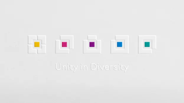
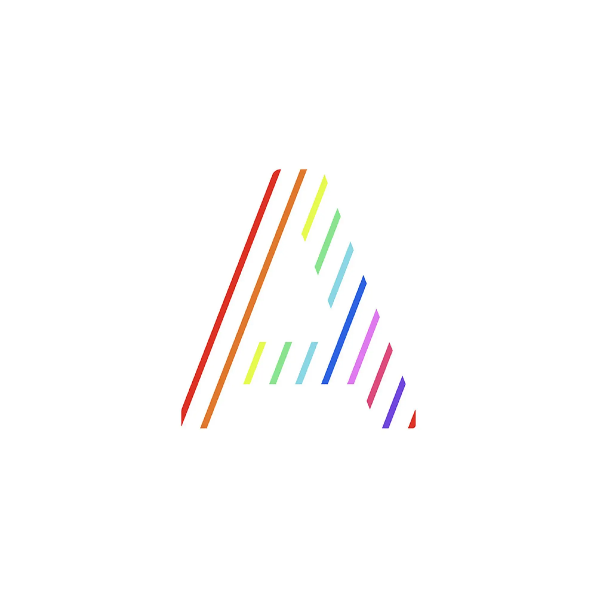
Using a single A in the logo creates a sense of presence that embodies A Inc.’s vision (“illuminating people’s potential”) and mission (“for a world that believes in the power of what people like”). The meanings invested in the logo are: Stripes signify the energy and potential of everyone involved with A Inc. > The A is an accumulation of multiple stripes > A Inc. takes shape through the power of its diversity of preferences.
The Jury‘s Statement
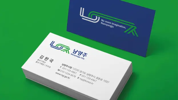
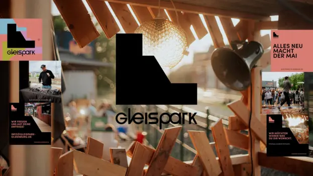
The appearance of A Inc. surprises with an unusual use of colour, from the logo in rainbow colours to the corporate design, which makes the brand recognisable at all touchpoints.