BALANCE Forum für Musik e. V.
Winner
Excellent Communications Design
Corporate Identity
Details
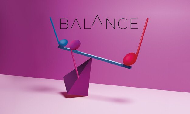
BALANCE is a collective of excellent musicians. Goal: to bring a new awareness of music to people. Task: develop a logo that will present Forum for Music, Ensemble and Concert Series as a recognisable Brand. Concept: create a visual and content-related connection between BALANCE and MUSIC. A "typographic scale graphic" is integrated within the lettering of the design. The image concept shows the musical balancing act as an installation. Colour concept: blue (major scale), red (minor scale). The blend of blue and red result in the violet (60bpm). In reference to Christianity violet refers to concert series at the Bergerkirche Stuttgart.
The Jury‘s Statement
The corporate design captivates with its clever integration of a 'typographic seesaw' that visually unites the various musical areas. The choice of colors creates a symbolic link to the concert series at the Bergerkirche Stuttgart, emphasizing the cultural contribution to classical music.