Stadtwerke Sigmaringen GmbH
Winner
Excellent Communications Design
Corporate Identity
Details
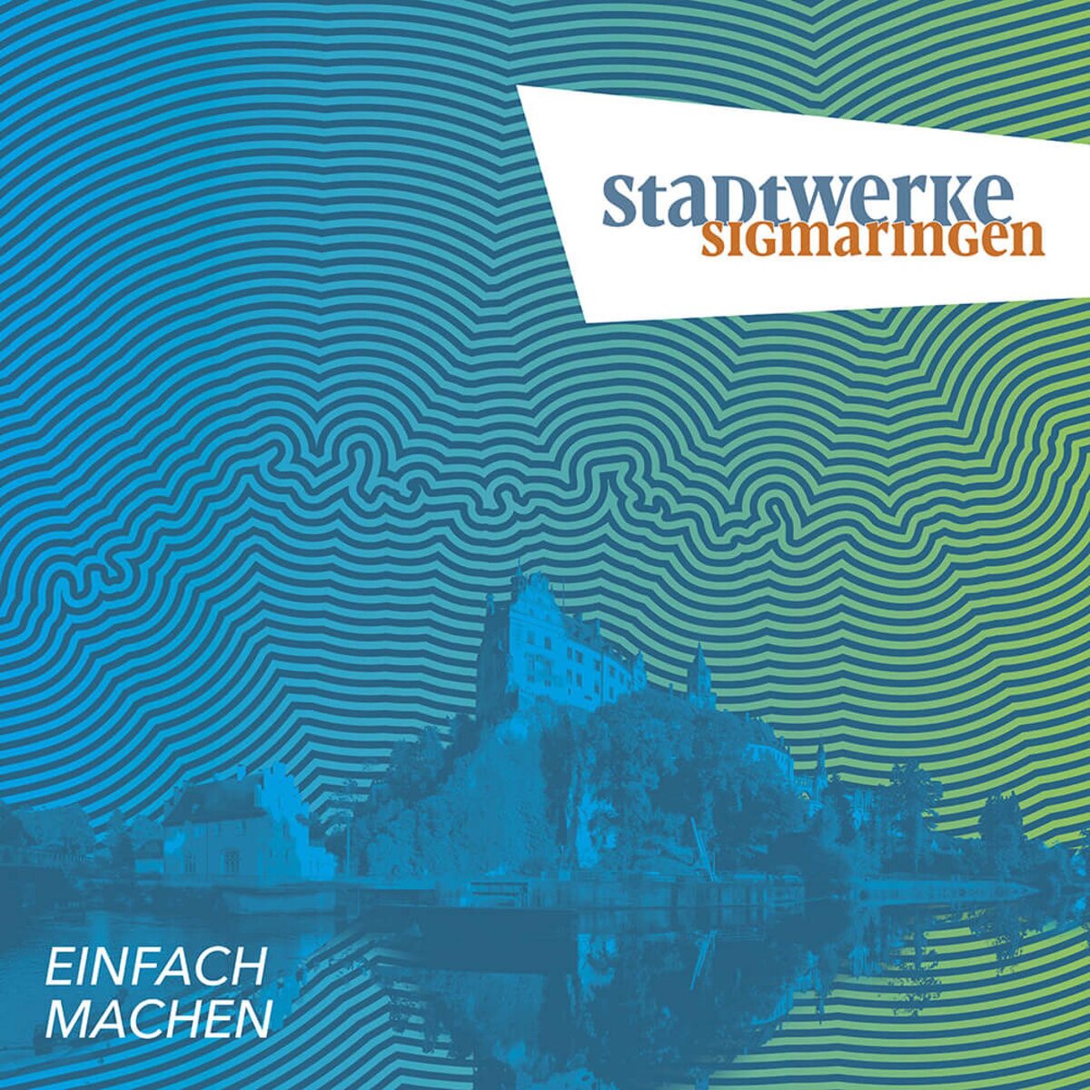
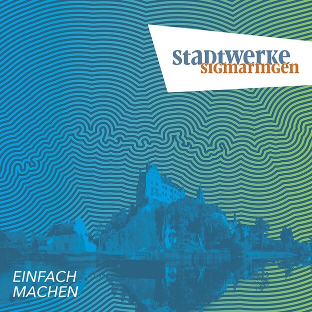
Stadtwerke Sigmaringen is an innovative provider of energy, water and mobility. The clear aim is to be a pioneer in the realisation of the energy transition. The brand concept and visual identity were developed to be coherent in terms of content and visually concise. The Danube plays a key role in this. It is a positive symbol for the region and stands for movement, dynamism and energy, as well as for the confluence of sustainable solutions. Its course is explicitly translated into the design in an eye-catching, variable pattern that guarantees a very high level of recognition.
The Jury‘s Statement
The corporate identity of ‘Stadtwerke Sigmaringen’ picks up on the dynamism and energy of the Danube in a modern, appealing and eye-catching way. The visual concept creates a high degree of recognisability through the variable wave pattern and reflects the regional ties of the municipal company.