PIERO Olive Oil
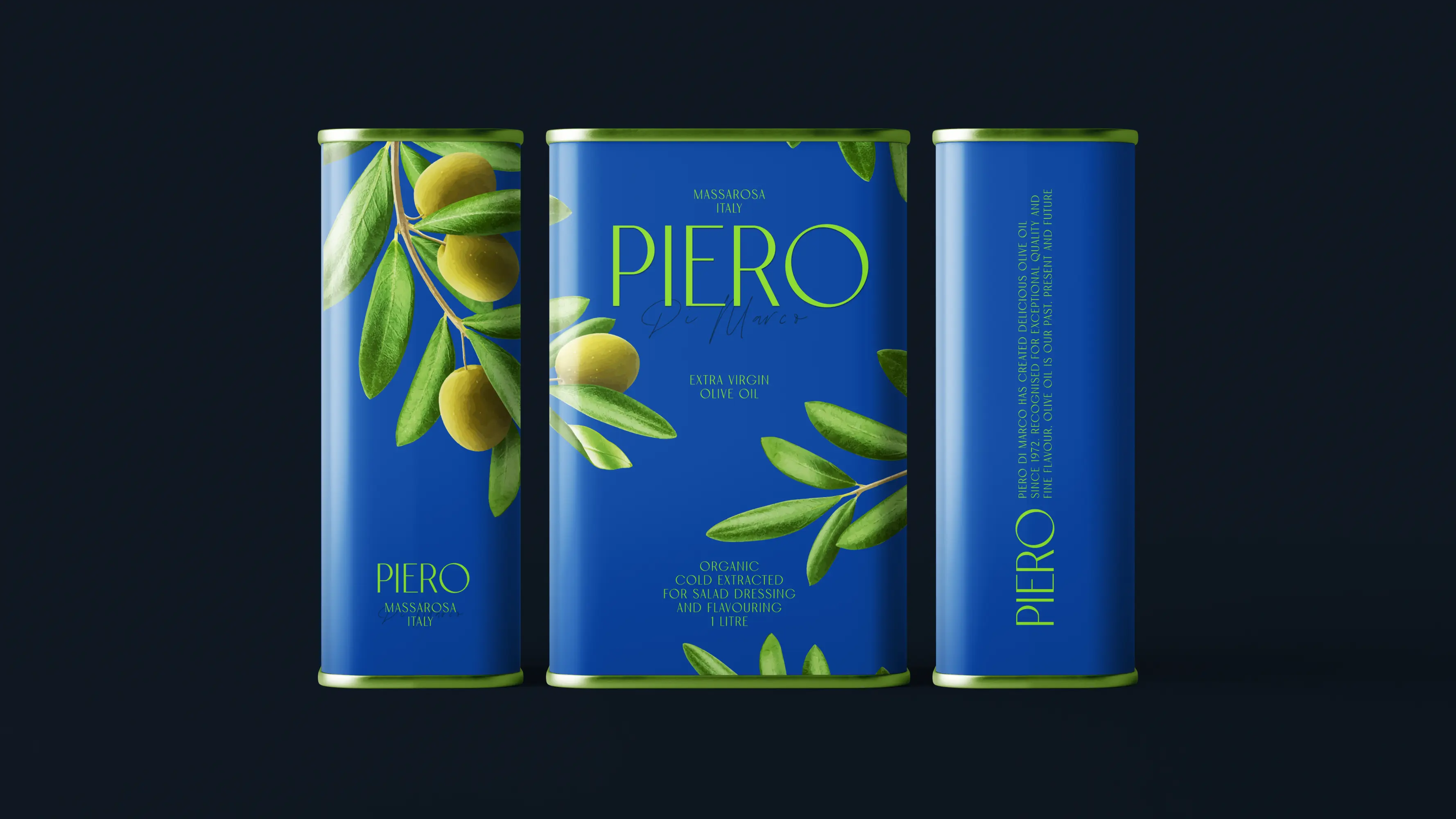
Details
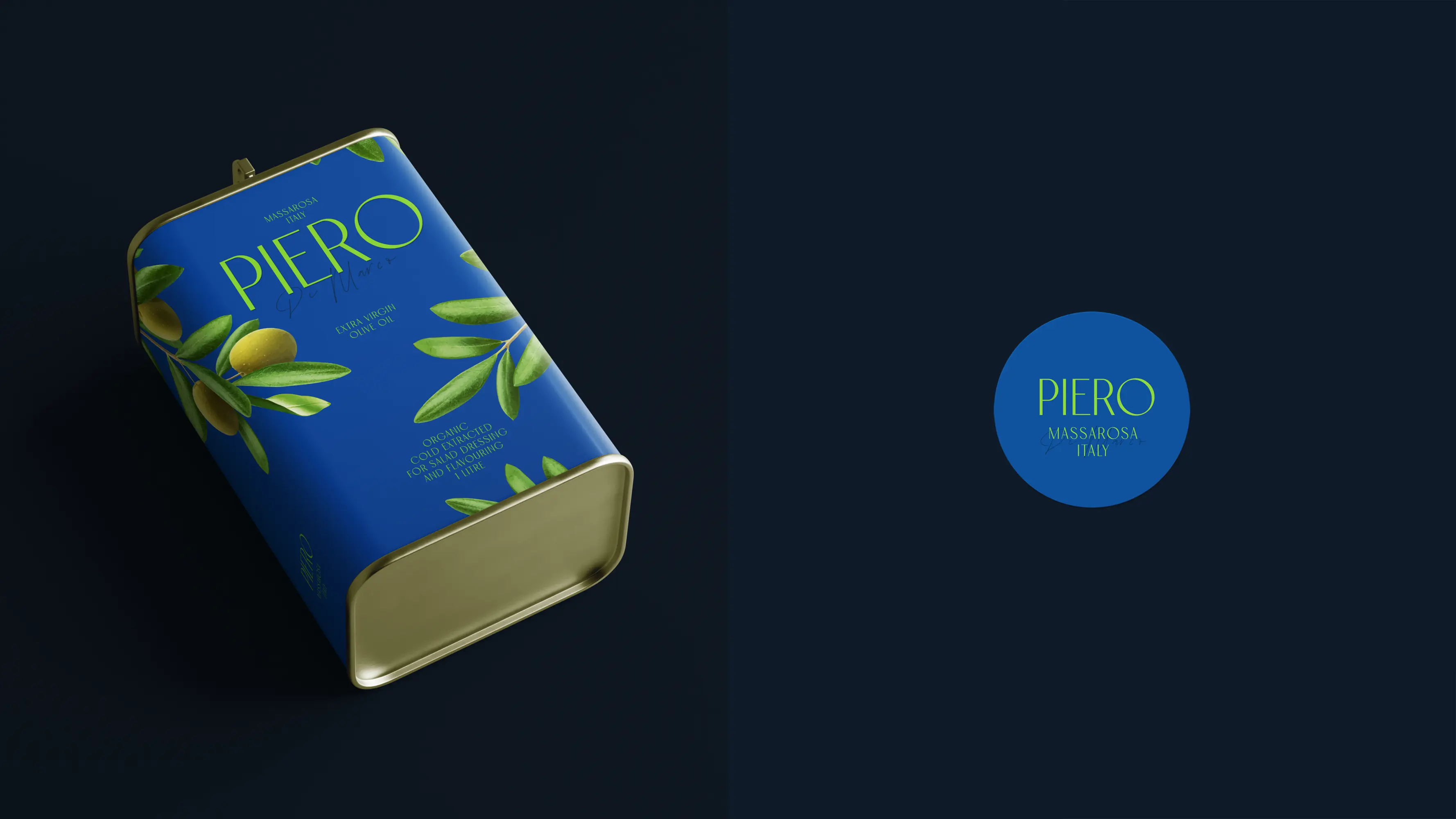
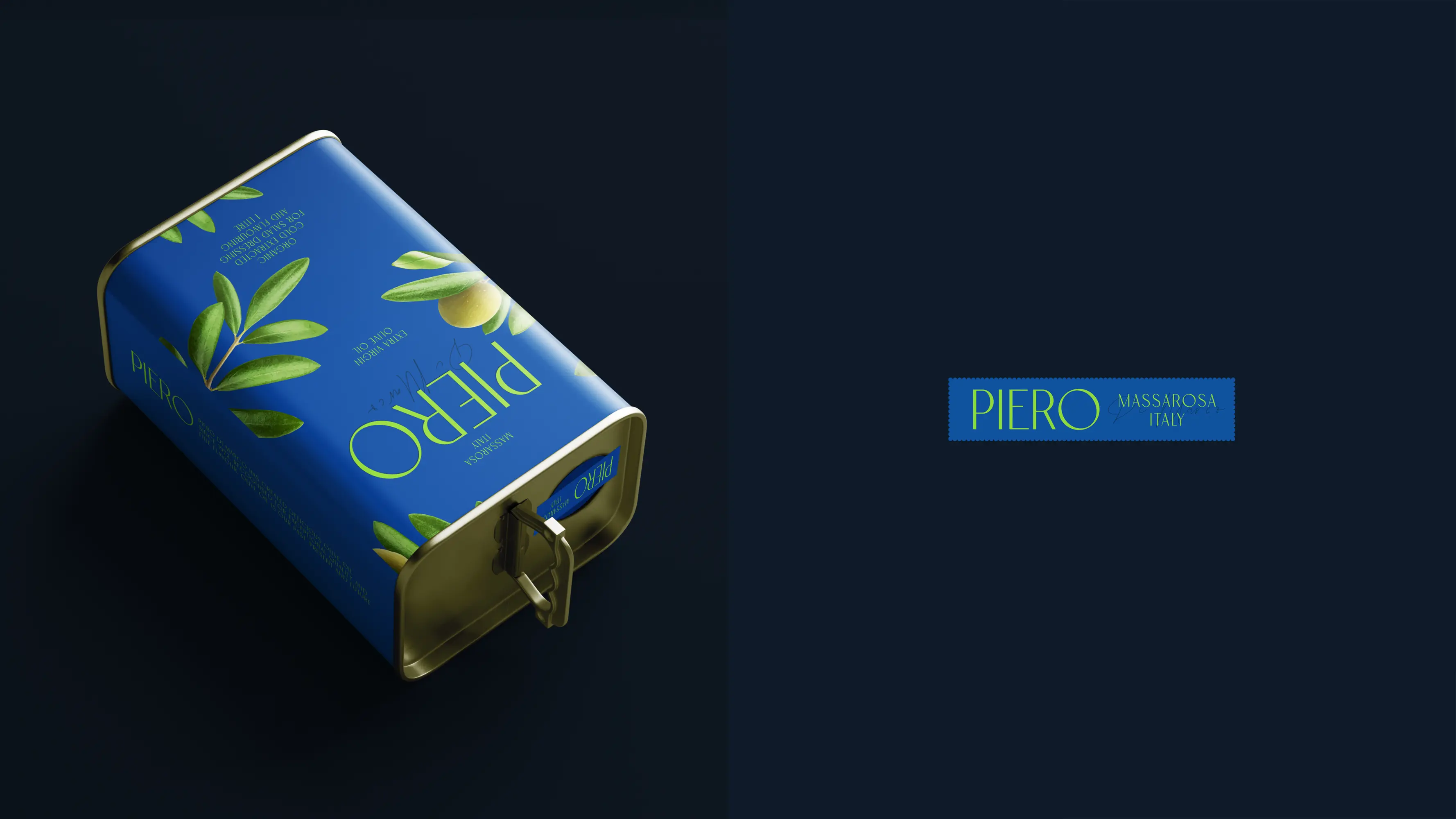
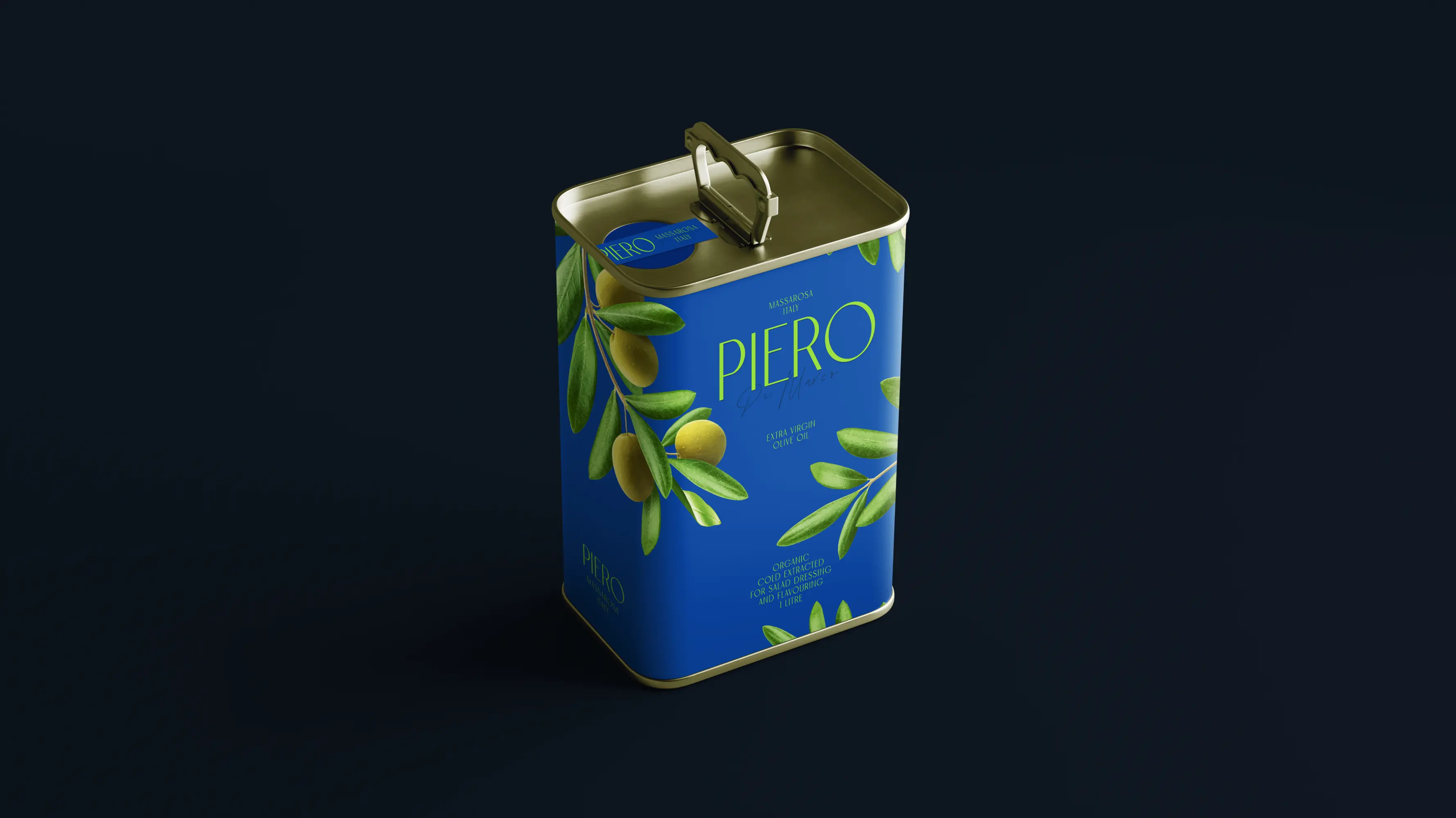
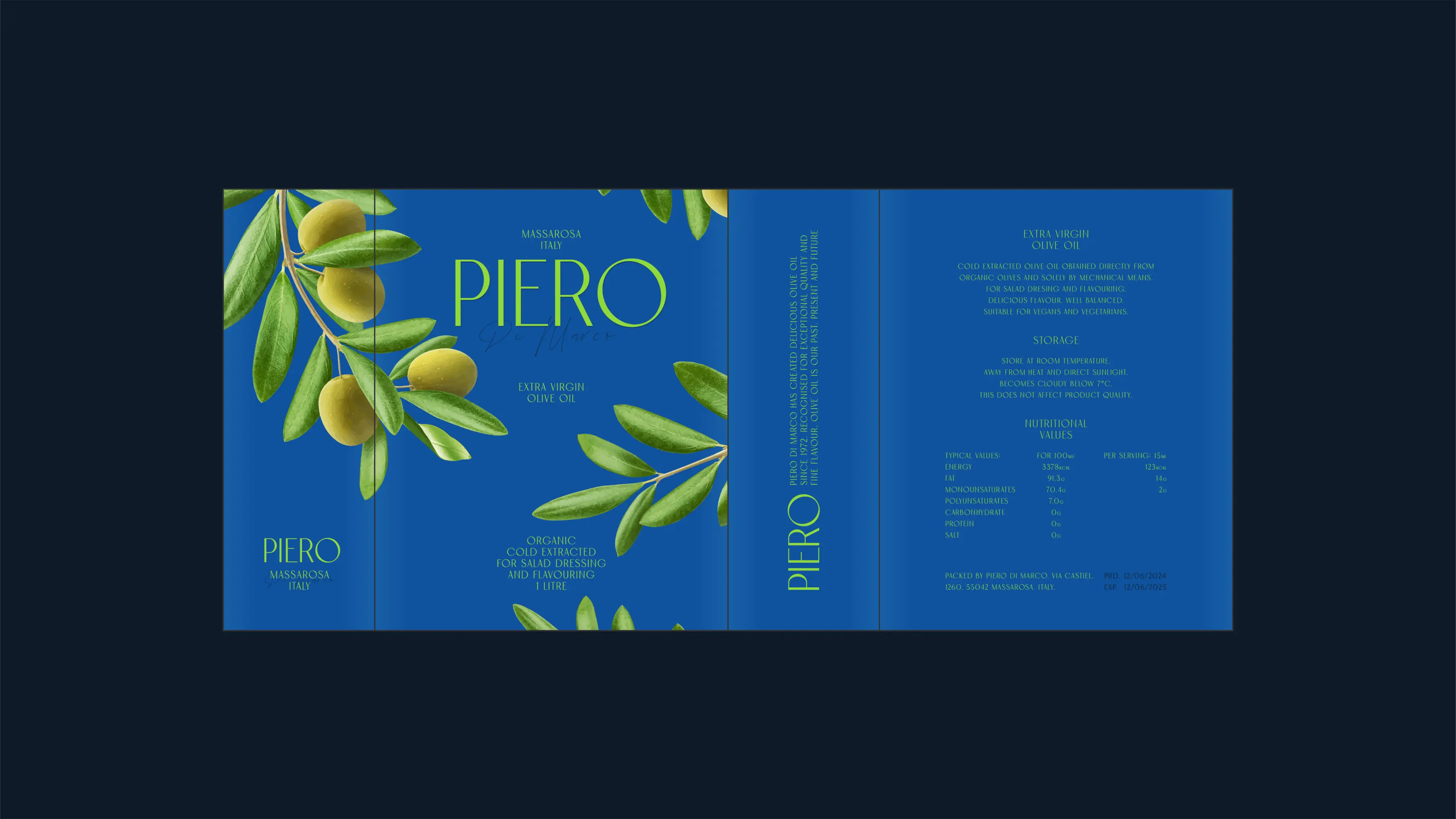
Olive oil packaging often leans to deep browns and greens to suggest richness and authenticity, leading to dull sameness on shelves. To reflect PIERO’s artisanal and organic values while standing out, this design takes a fresh approach. It found inspiration from the serene beauty of olive groves—branches gently swaying against a clear sky. This evocative scene, brought to life through detailed illustrations and a refreshing, majestic jewel-toned blue as primary colour, evokes a sense of natural, unadulterated purity echoing brand commitment, forming a clean, refined visual identity that is both striking and timeless.