Bayer Sans
Winner
Excellent Communications Design
Typography
Details
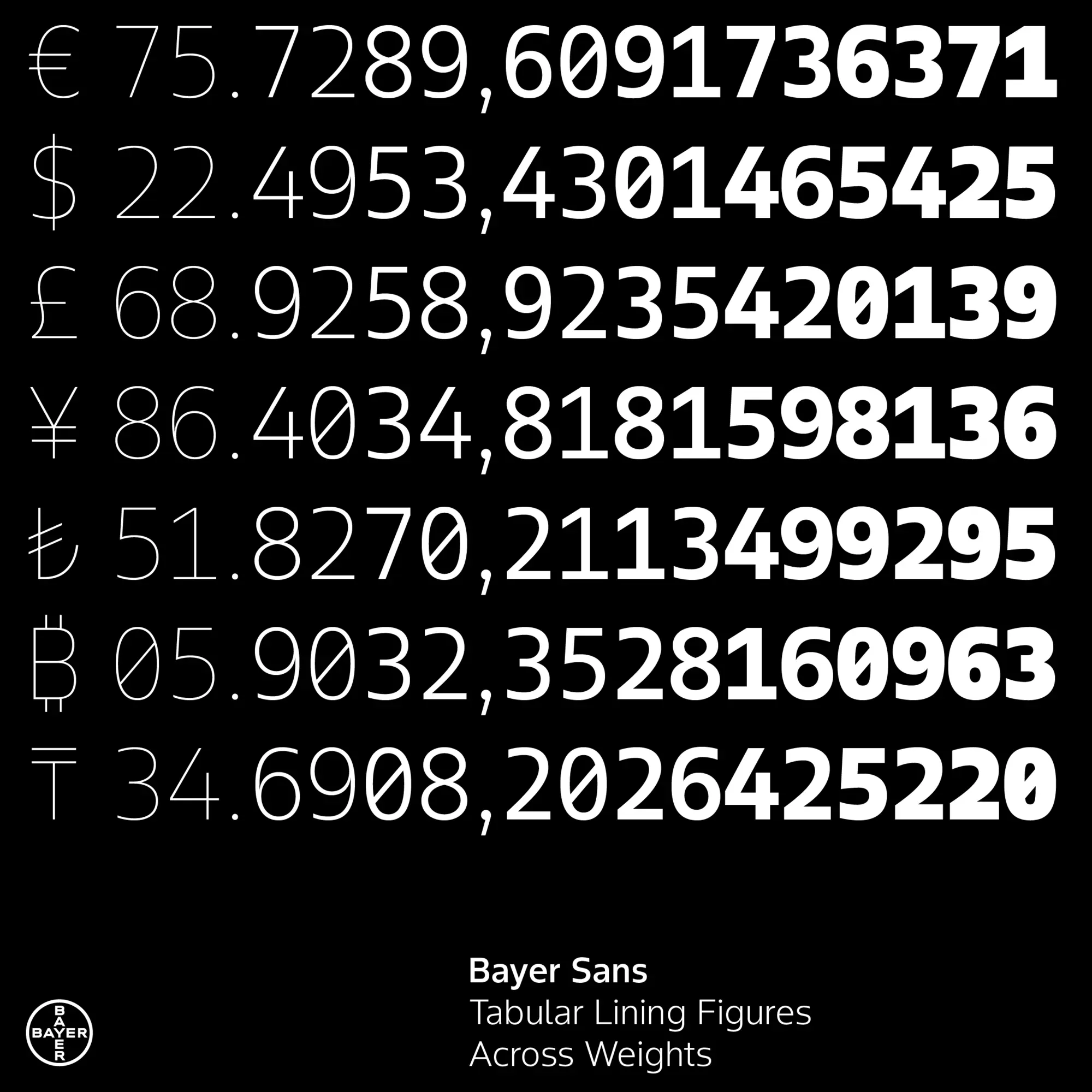
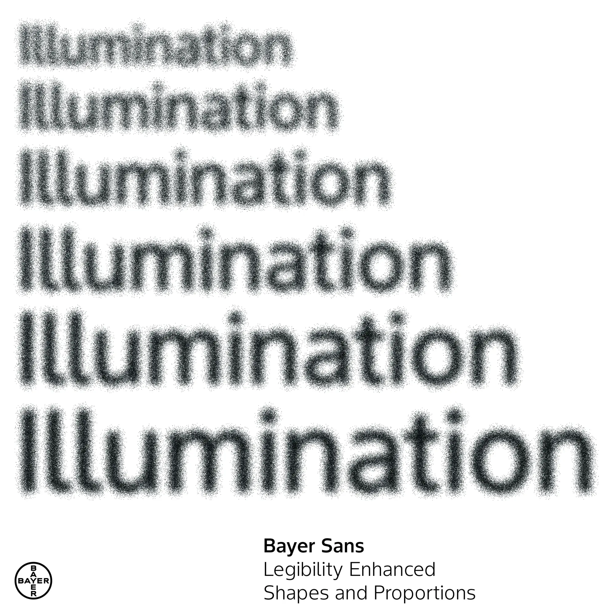
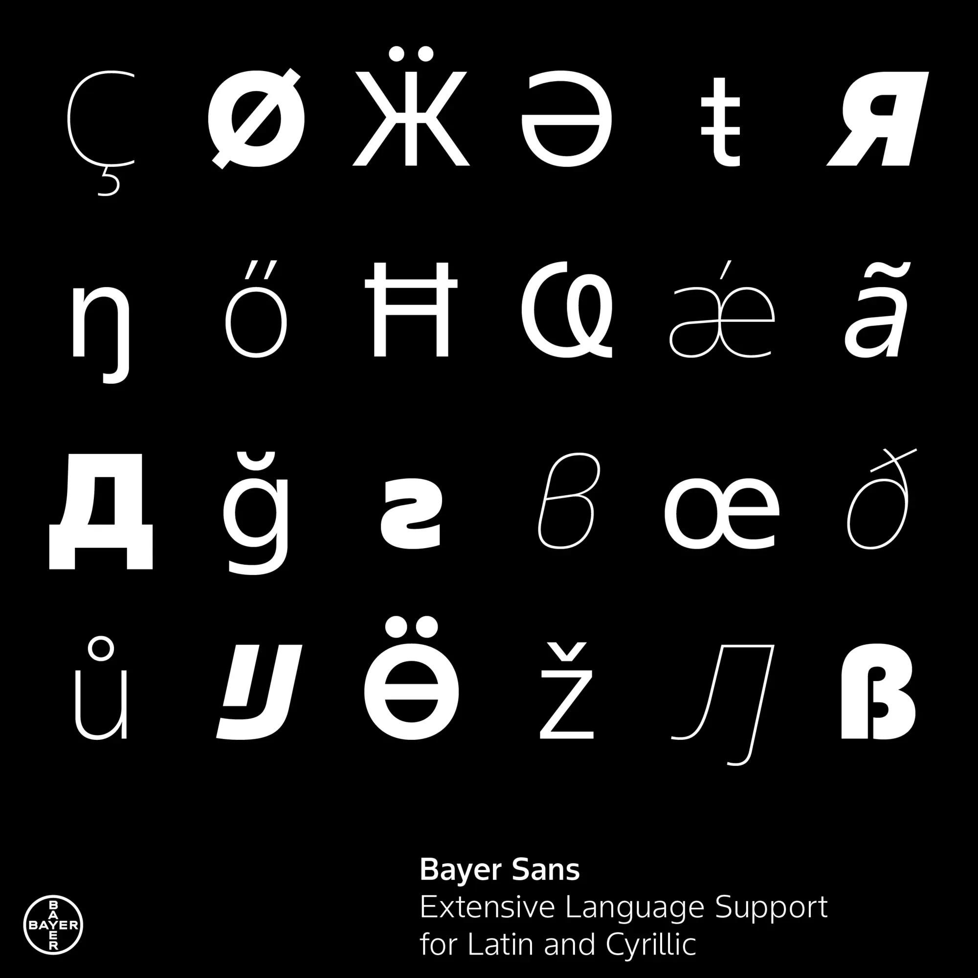
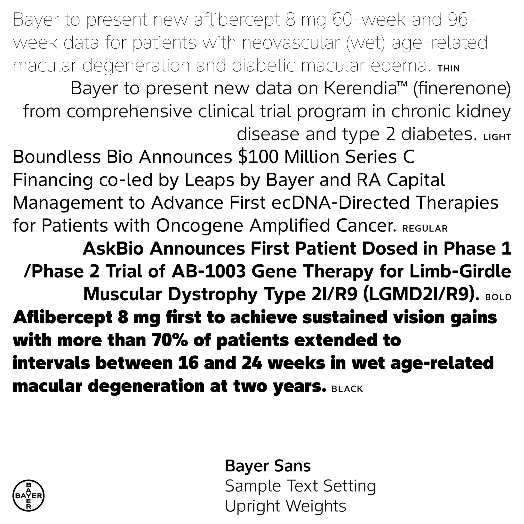
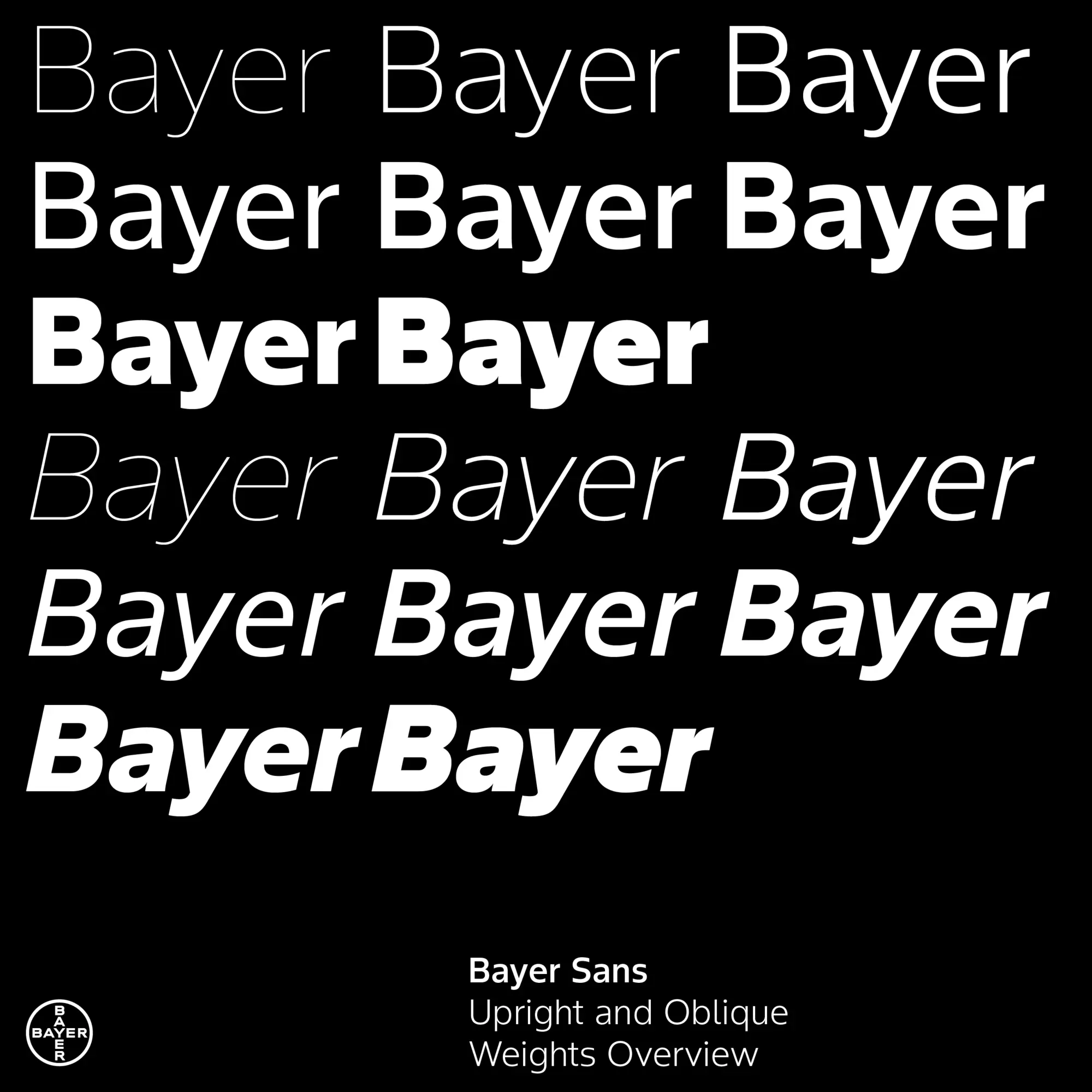
Propelled by the motto “zero side effect, maximal impact” a small team of interdisciplinary experts set out to design BayerSans — a custom corporate typeface for a leading global life science company. Guided by core design principles such as readability, simplicity and appeal, BayerSans is conceived as an all-purpose, no-frills design which works seamlessly across a multitude of media, geographies and cultures. Equally informed by scientific rationality and human sensuality, BayerSans is made for longevity above all. Equipped with everything, a brand like Bayer needs from a typeface to tackle contemporary and future challenges.
The Jury‘s Statement
Clarity and timelessness define »Bayer Sans« at every level. The typeface masterfully combines scientific precision with subtle warmth, while remaining consistently legible and versatile. Particularly impressive is the harmonious balance between functionality and aesthetics, enabling globally consistent communication. This distinctive typography convinces through its lasting impact and sets a powerful, confident statement in the competition.