KkomKkom
Winner
Excellent Communications Design
Typography
Details
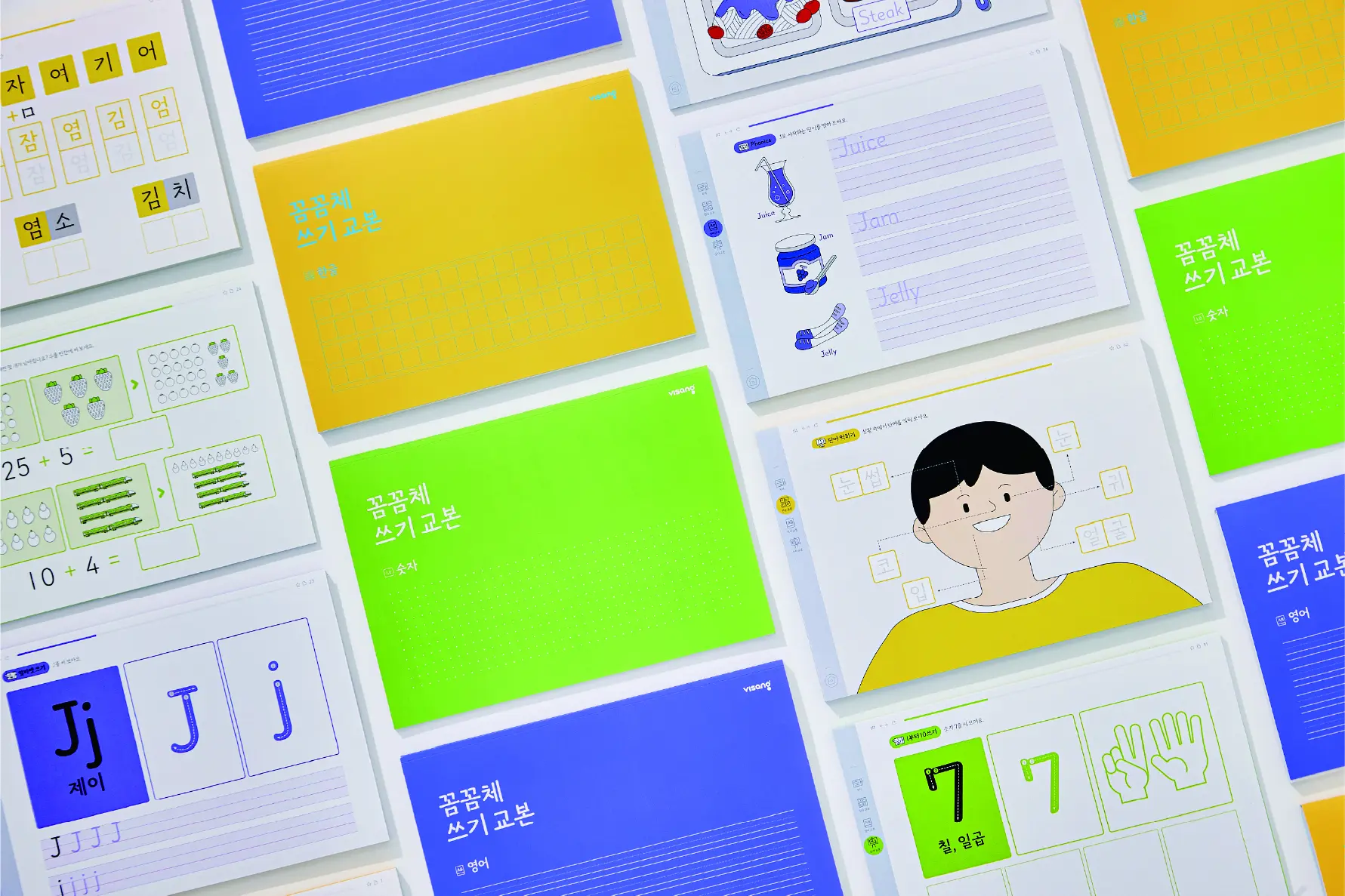
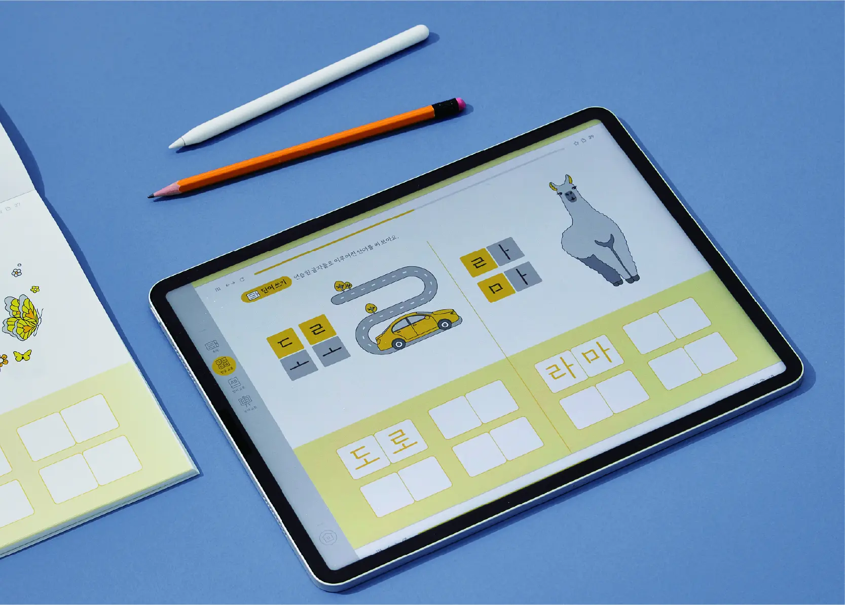
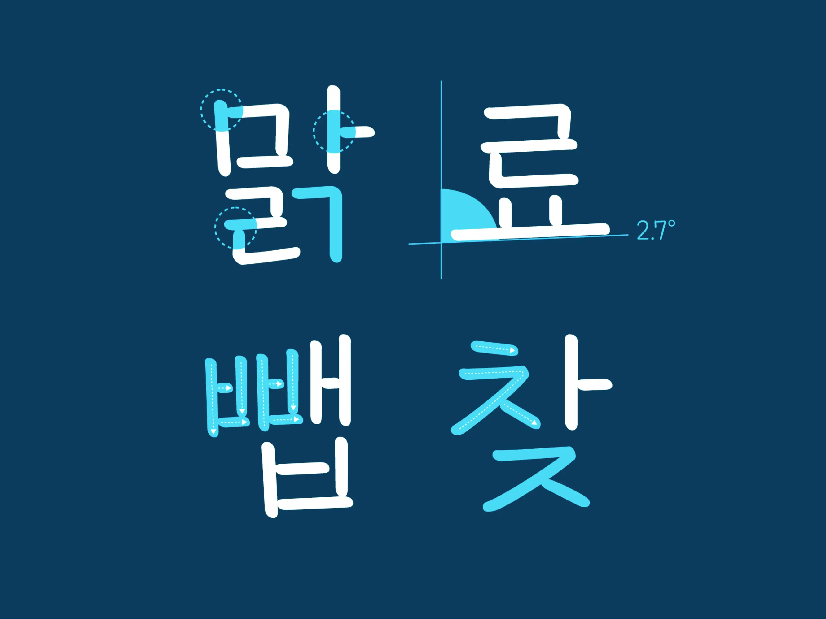
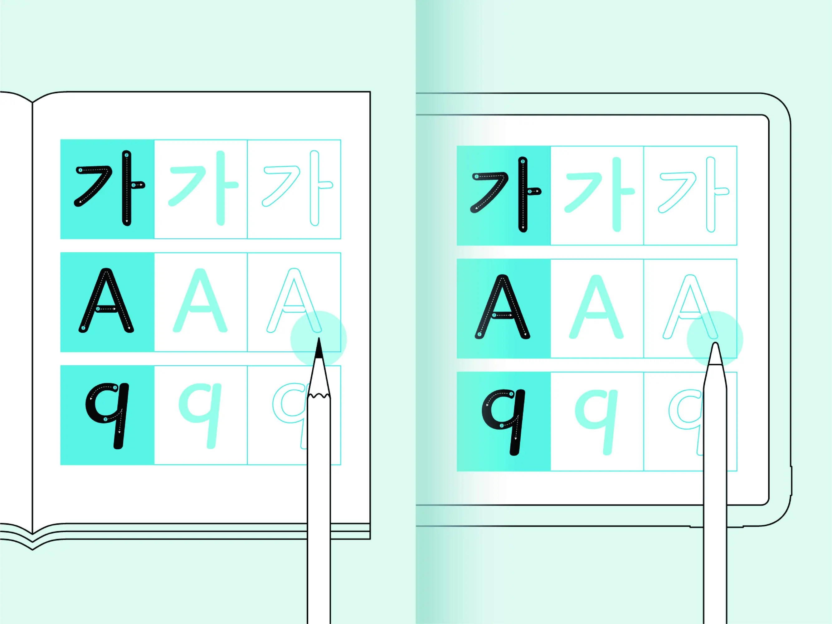
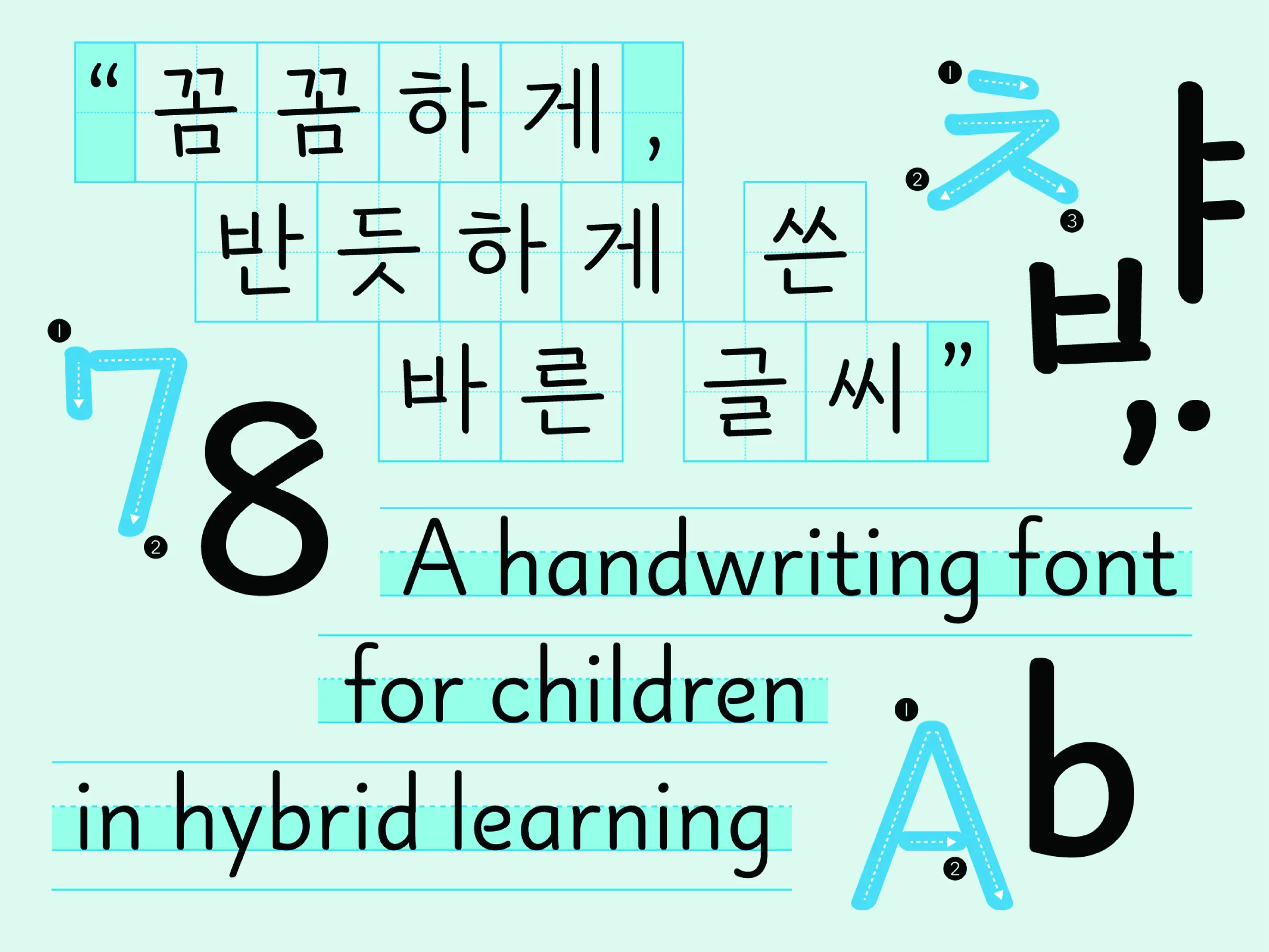
KkomKkom is a Korean typeface optimized for children learning to write in both digital and analog environments. Traditional brushes have been replaced by pencils and electronic styli, but existing fonts still emulate brush forms. So Visang designed their new typeface to use strokes of constant thickness, thus more clearly showing stroke order and direction. It also uses a slight horizontal slant to help young writers still developing their motor skills write lines more easily. Distributed free with textbooks, KkomKkom serves students as well as their parents and teachers, thus claiming its role as a new, meaningful learning tool in the field.
The Jury‘s Statement
The consistent focus on the motor development of beginning writers makes »KkomKkom« particularly relevant. Its clear design with nearly constant stroke width, subtle tilt, and memorable stroke guidance supports intuitive writing across all media. The typeface impresses with its unwavering functionality and a high degree of aesthetic clarity – an outstanding, gold-worthy achievement in the design of type for young learners.