Jan Knopp: How Design Creates Meaning
A design nudge in communication design is a way of guiding people through visual hierarchy, typography and colour so they reach orientation and meaning quickly. Corporate design therefore does not start with messages, but with a system that communicates before a single word is read.
Three elements make this approach tangible in the corporate design for "Tanzhaus Basel":
- Typography: sets rhythm and attitude within seconds.
- Colour language: creates recognition through relationships between colours.
- Orientation system: connects space, programme and touchpoints into one consistent experience.
Communication Begins Long Before the First Message
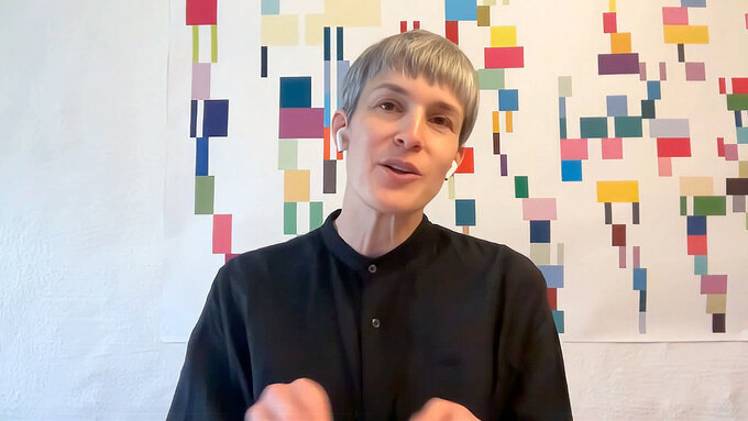
Most brands think about communication from content first. They start with copy, campaigns or messaging. Design comes afterwards. Jan Knopp (Designer und Partner, Knopp & Kniel) challenges that order: "Design becomes part of communication the moment it is created. In fact, design is the foundation of all communication."
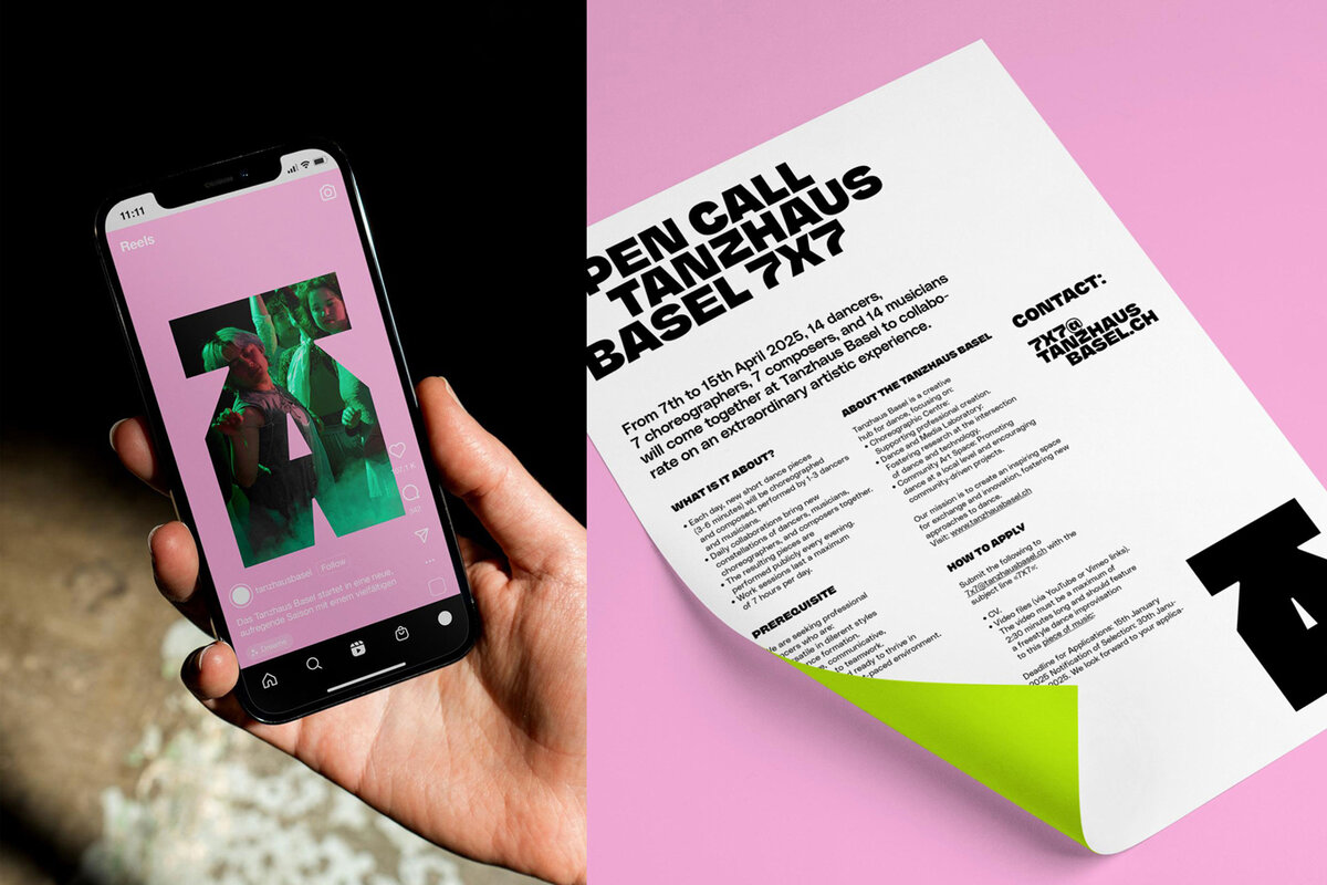
This idea defines the corporate design of Tanzhaus Basel. Rather than treating design as packaging, Knopp & Kniel treat it as expression. The visual system brings together print, digital applications, signage, programme communication and spatial orientation into one consistent identity.
"Design is the foundation of all communication."
Design Turns Information into Experience
Information becomes an experience when design communicates its value in a way that is easy to understand. For cultural institutions, this matters because programmes are complex and audiences are diverse.
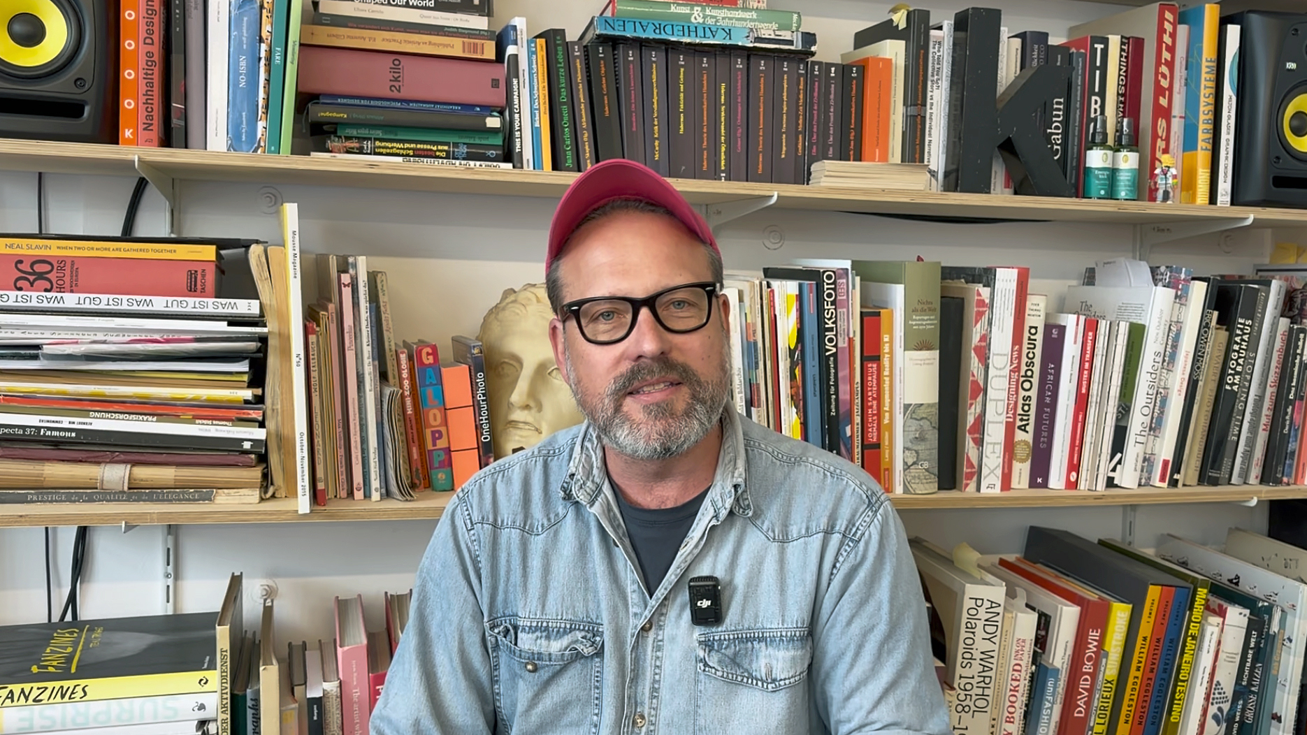
Benjamin Kniel (Designer und Partner, Knopp & Kniel) puts it like this: "Information becomes an experience when design communicates its value, joy, energy and meaning in a way that is easy to understand and enjoyable."
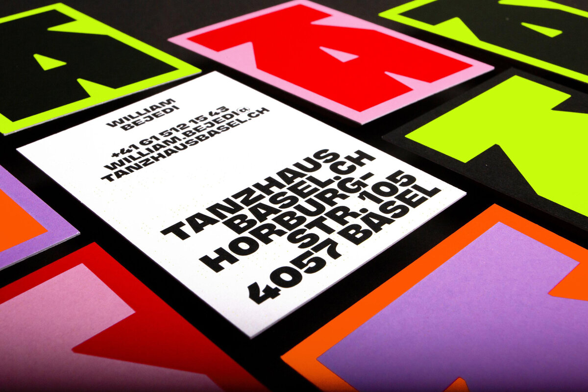
The corporate design for Tanzhaus Basel follows exactly this principle. It creates orientation without becoming generic. It informs without feeling clinical. Design itself becomes part of the experience, expressing the energy and openness of the institution in every application.
Typography Brings Information Straight to the Point
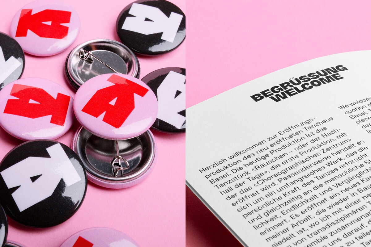
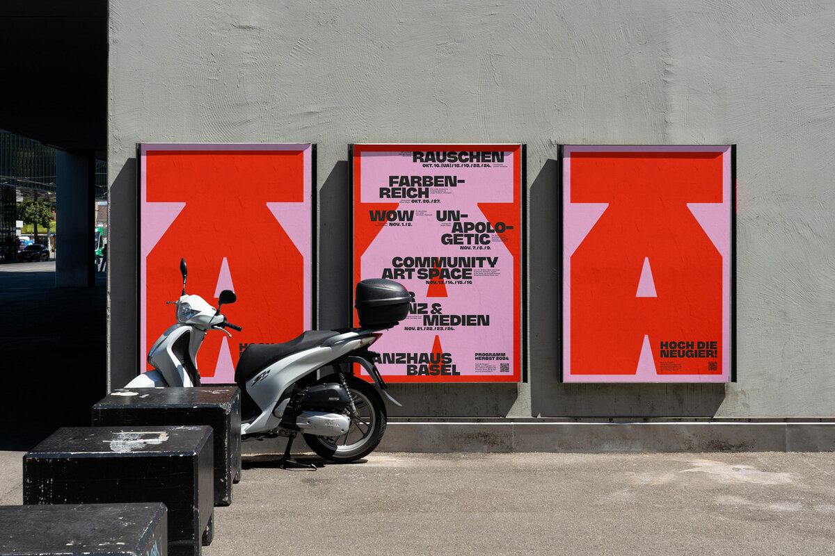
Typography works before people start reading. It communicates attitude, emotion and character within seconds: "Typography can be loud, quiet or completely wild. It brings information straight to the point."
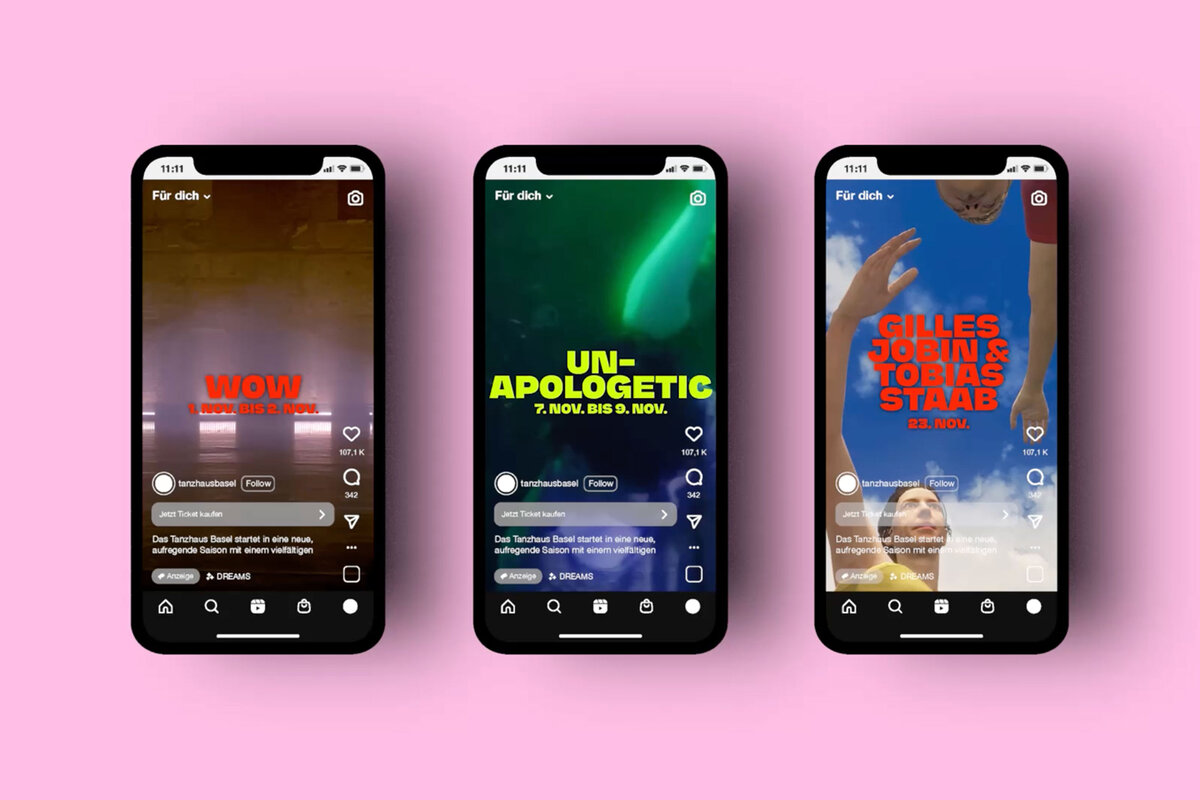
The system is complemented by a custom colour language. The two designers explain: "For Tanzhaus Basel, we developed our own colour language using complementary colours that work with great intensity and specially developed spot colours." The result is a distinctive palette that gives Tanzhaus Basel an unmistakable identity.
Colour Creates Meaning Through Relationships
Meaning does not come from a single colour. It emerges when colours work together: "A single colour has meaning, but on its own it says very little. It is when colours come together that they begin to communicate and create meaning."
Colour therefore becomes a communication tool in its own right. Recognition is not created by individual colours, but by the way they intentionally work together.
Design Tells People Who a Brand Is
Strong brand identities are not built through more messages. They are built through a system where typography, colour, space and information speak the same language.
The German Design Awards recognise projects that use design as a strategic tool and rethink the way brands communicate. The corporate design for "Tanzhaus Basel" shows how design makes identity visible and turns information into experience.
If your project offers new answers to the challenges of our time, now is the moment: register for the German Design Awards 2027, present your work to an international jury, and become part of a global network of design excellence.