Neues Brand-Design für das Ostschweizer Familienunternehmen «Wanner Immobilien»
Winner
Excellent Communications Design
Brand Identity
Details
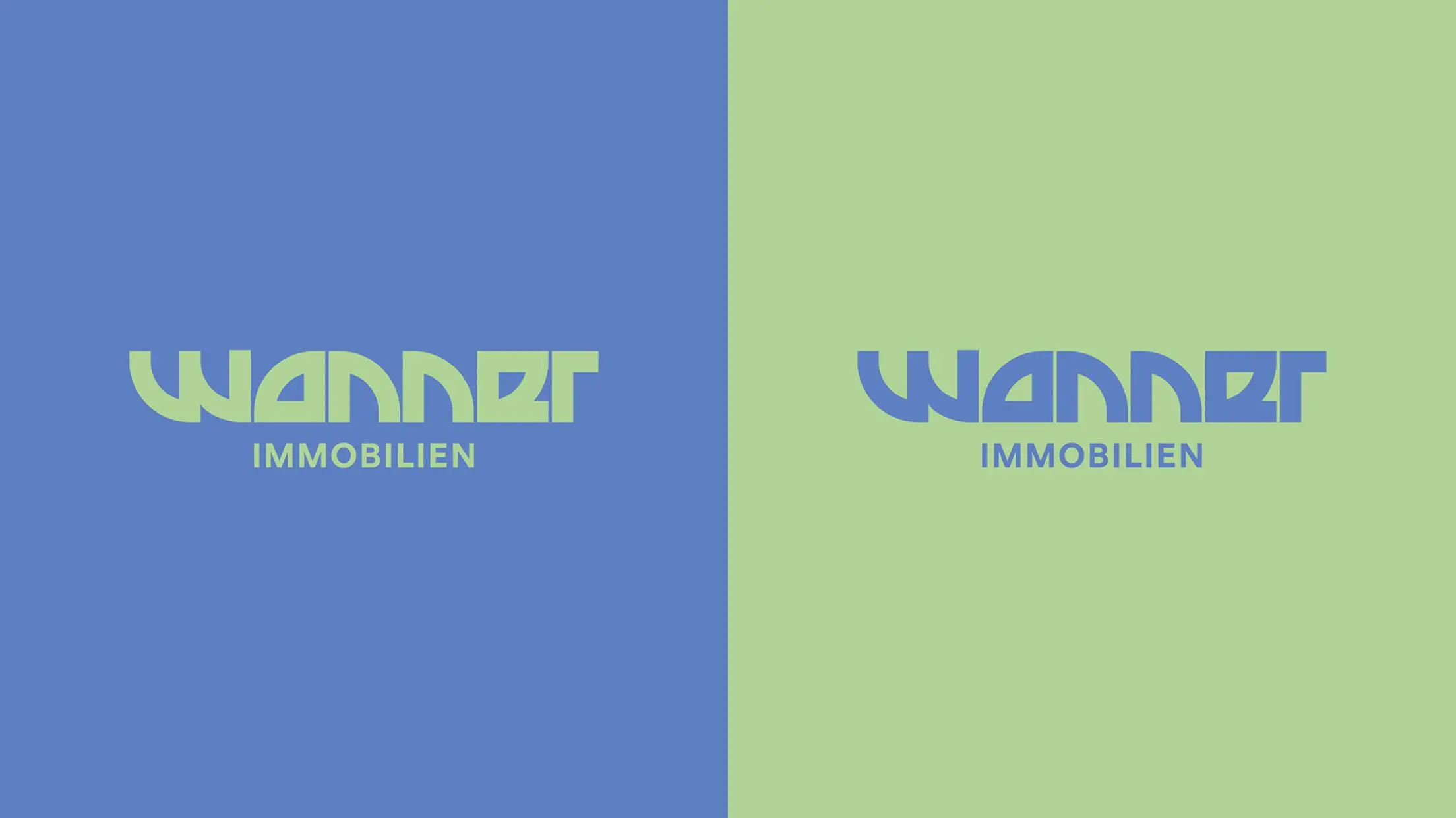
The custom wordmark is a nod to the foundation of any property - the floor plan. The entire visual identity is based on the floor plan of doorways, as Wanner Immobilien symbolically opens doors for new property owners as well as closes them for sellers. Hand-drawn illustrations add a casual touch to the brand image and provide a pleasant change in the otherwise rather monotonous real estate communication.
The Jury‘s Statement
For the new identity of the real estate company Wanner, the graphic symbol for "door" in floor plans was translated into typology, giving the logo lettering an original independence. The simple design of the brand world with its hand-drawn illustrations is sympathetic and clarifies the down-to-earth attitude of the family business.