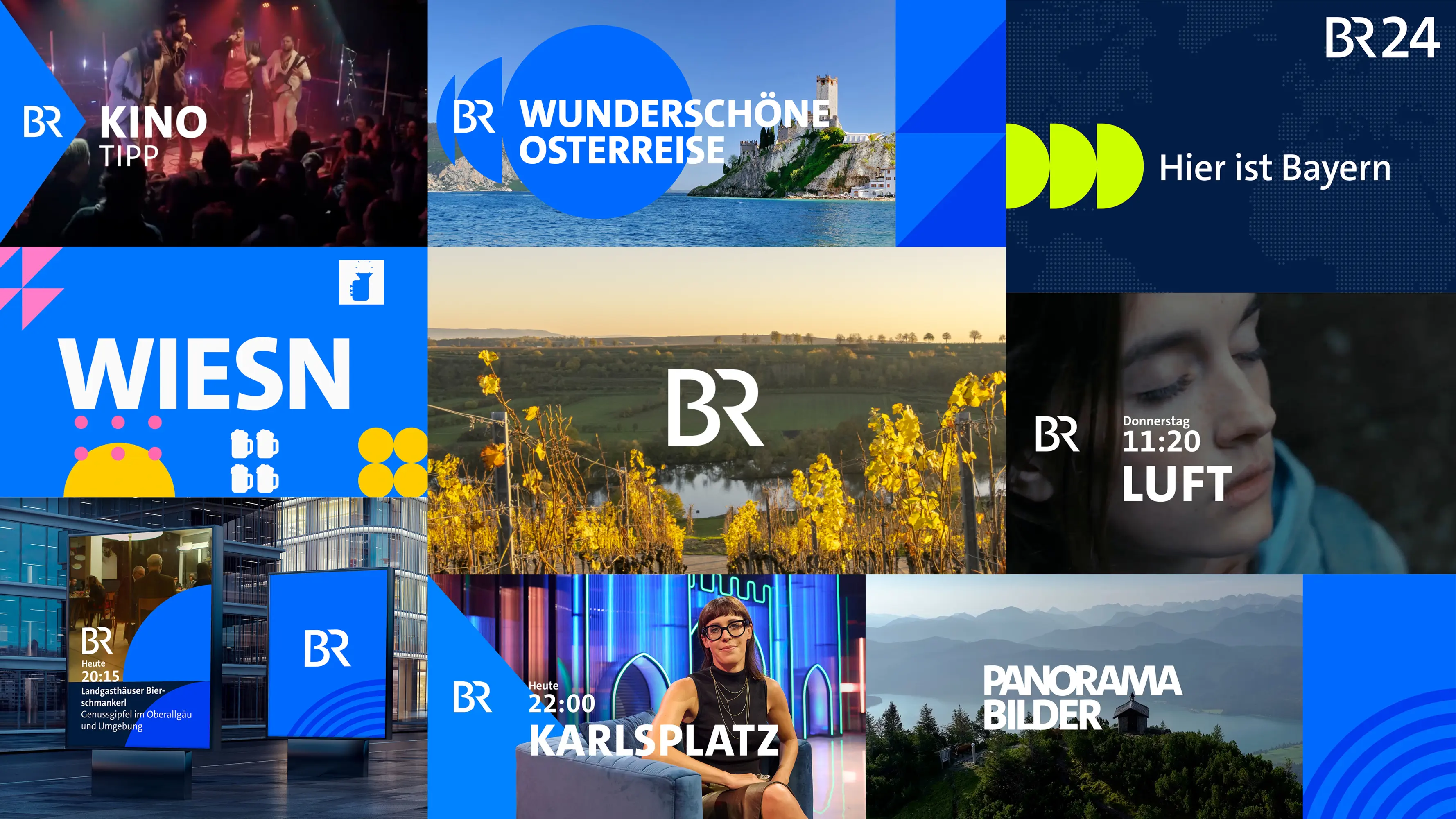
BR Motiondesign
Winner
Excellent Communications Design
Corporate Identity
Details
Bayerischer Rundfunk’s new motion design has proven to be a further step towards a unified look and a clear visual brand identity. Deduced from the specific form elements constituting the BR logo, the consistent use of circles, squares and triangles characterises the design vocabulary: It is the brand Bayerischer Rundfunk which is given top priority. The standardised character font as well as a distinctive animation concept guarantee visual recognisability, which links the programmes of Bayerischer Rundfunk even further, thereby ensuring they are clearly recognisable as parts of one joint brand family.
The Jury‘s Statement
The consistent use of circles, squares and triangles gives »BR Motiondesign« a distinctive, characterful identity. Striking animations, a confident color palette and the unified font ensure unmistakable recognition. The design impresses with its harmonious blend of aesthetics, functionality and strategic brand management. This achievement sets an impressively high benchmark for clarity and consistency.