GO!PHA
Winner
Excellent Communications Design
Corporate Identity

Details
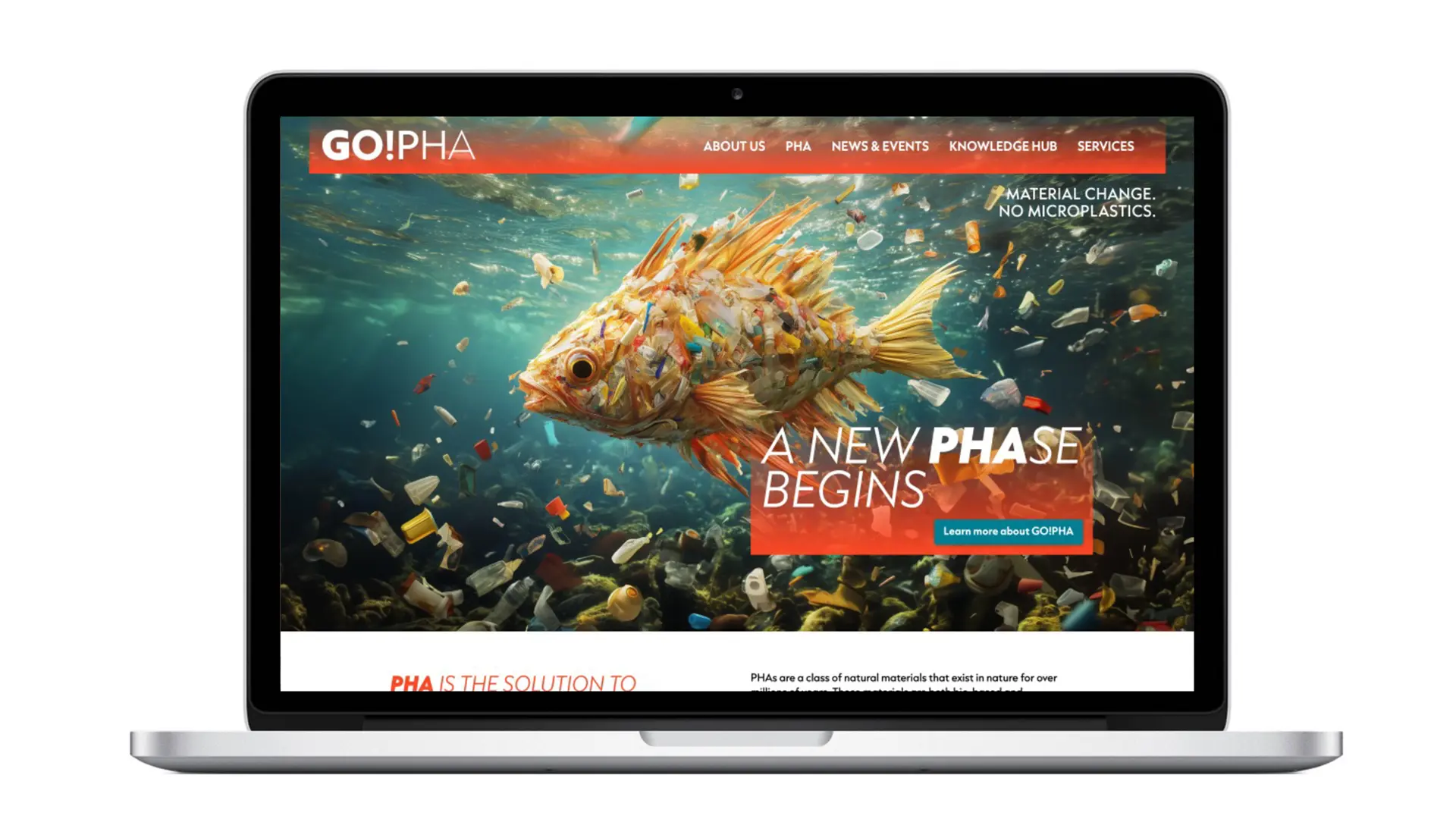
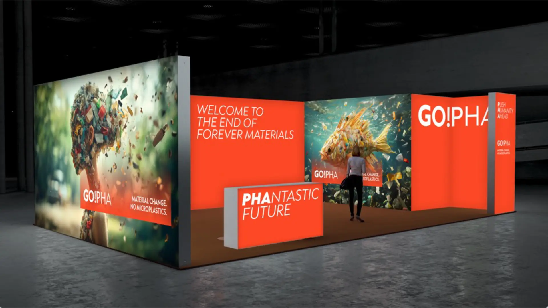
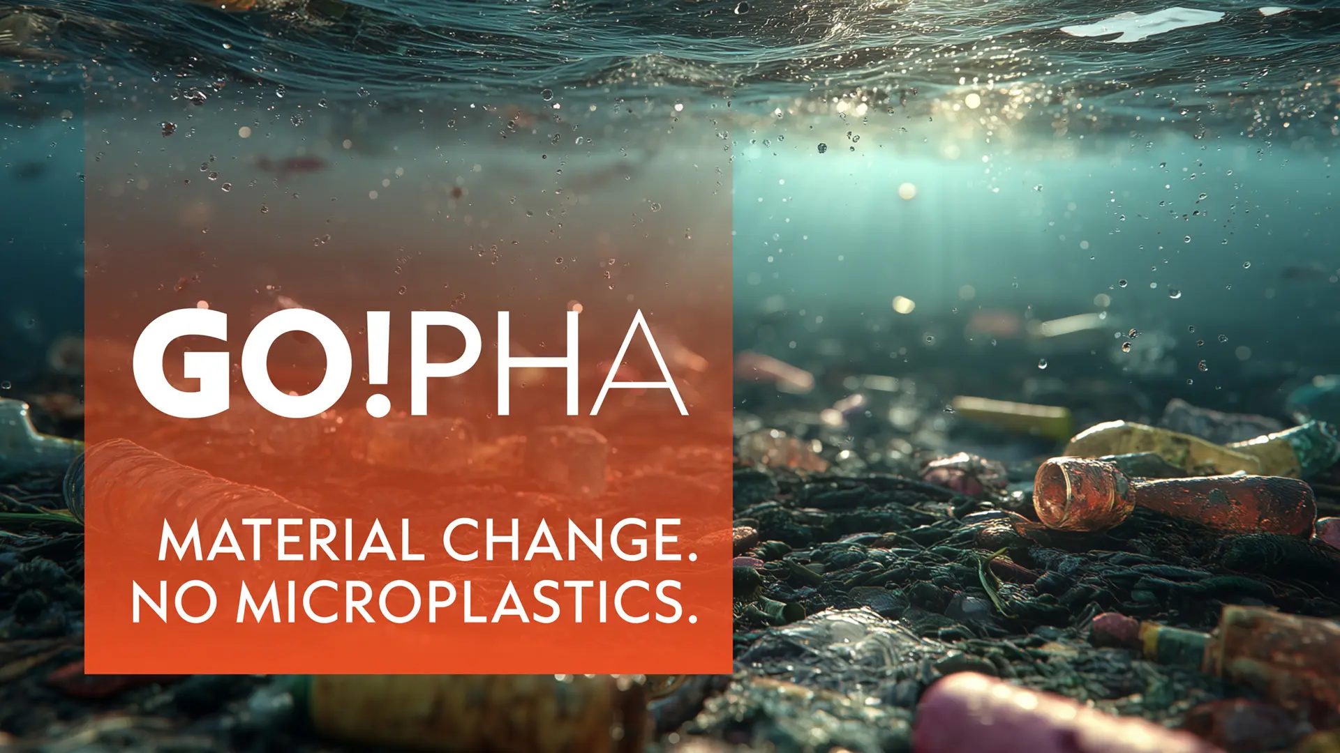
GO!PHA turns the fight against microplastics into a visible brand promise. The new visual identity combines urgency with optimism: a bold orange deliberately breaks with the conventional blue‑green sustainability aesthetic. Striking headlines, a distinctive logo, and attention‑grabbing key visuals create maximum clarity across all touchpoints – from campaigns to the summit. Material Change is not just communicated but made tangible as coherent, excellent communication design.
The Jury‘s Statement
The visual identity impresses with a bold color concept that deliberately challenges conventions. »GO!PHA« combines striking headlines, a distinctive logo and iconic key visuals to create a charismatic, consistent brand presence. The interplay of urgency and optimism is tangible at every touchpoint. Especially remarkable is how the commitment to material change is communicated clearly, relevantly and in an identity-shaping way.