Public Officials Benefit Association(POBA) CI
Winner
Excellent Communications Design
Corporate Identity
Details
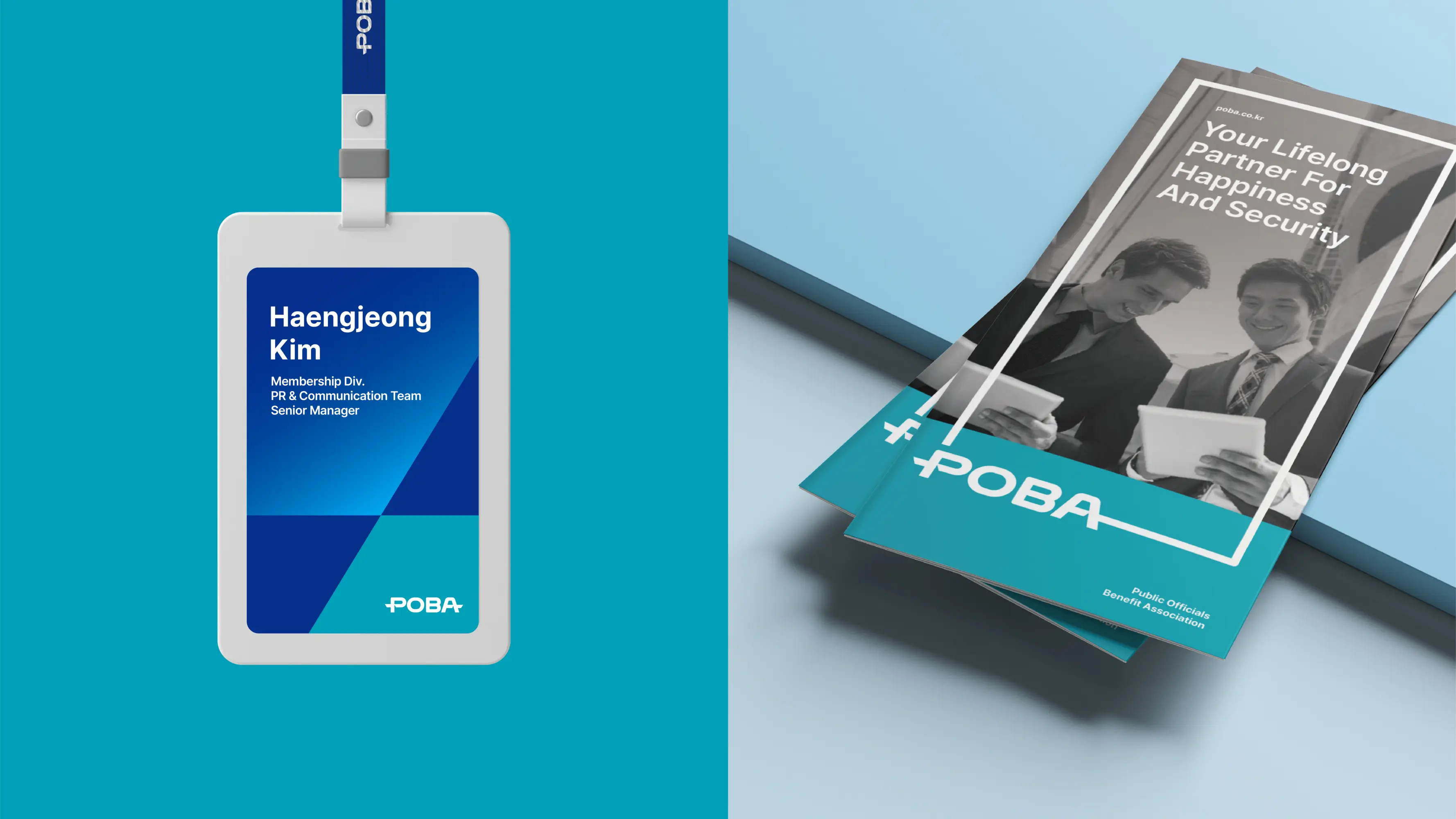
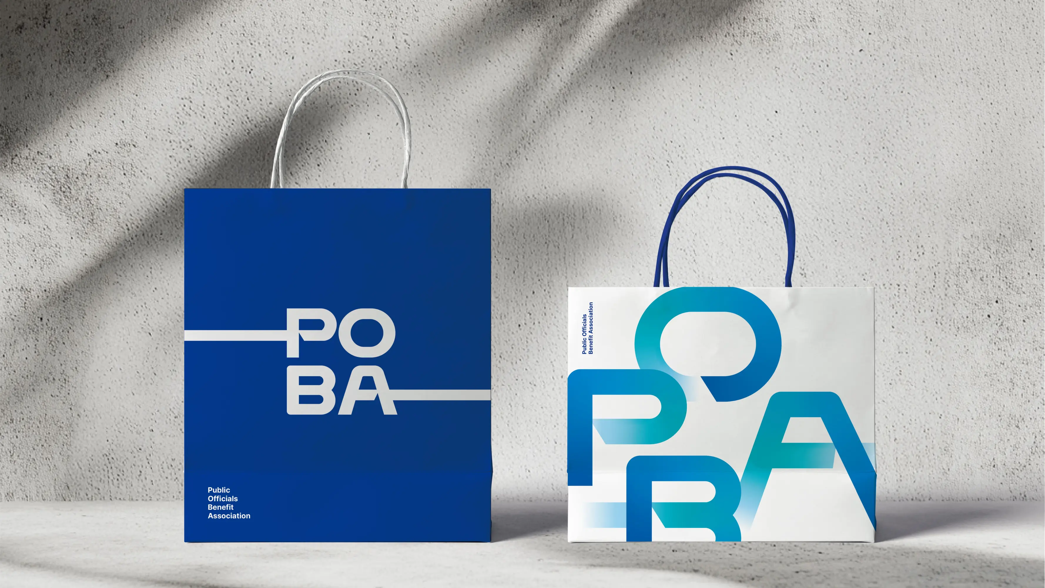
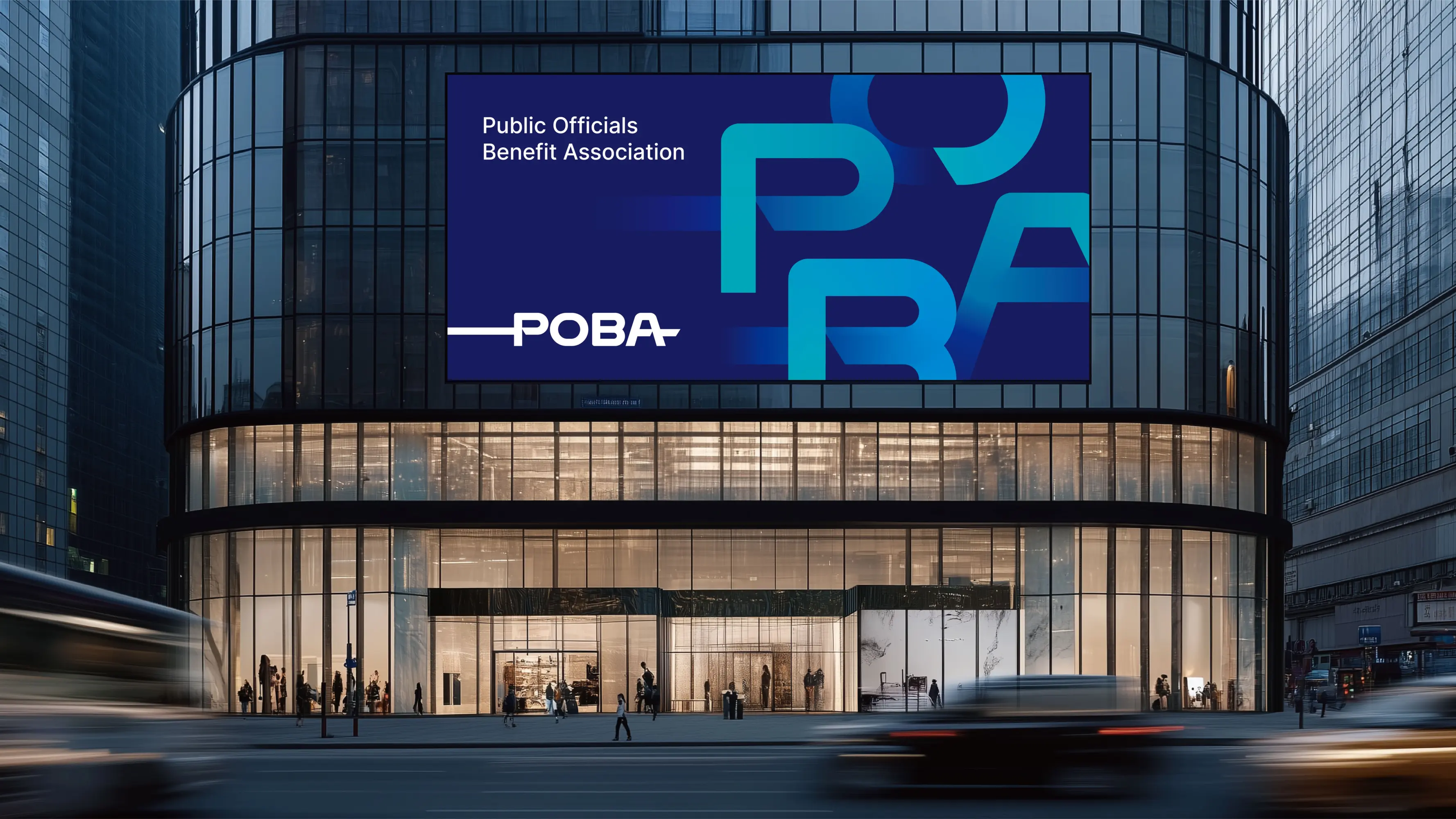
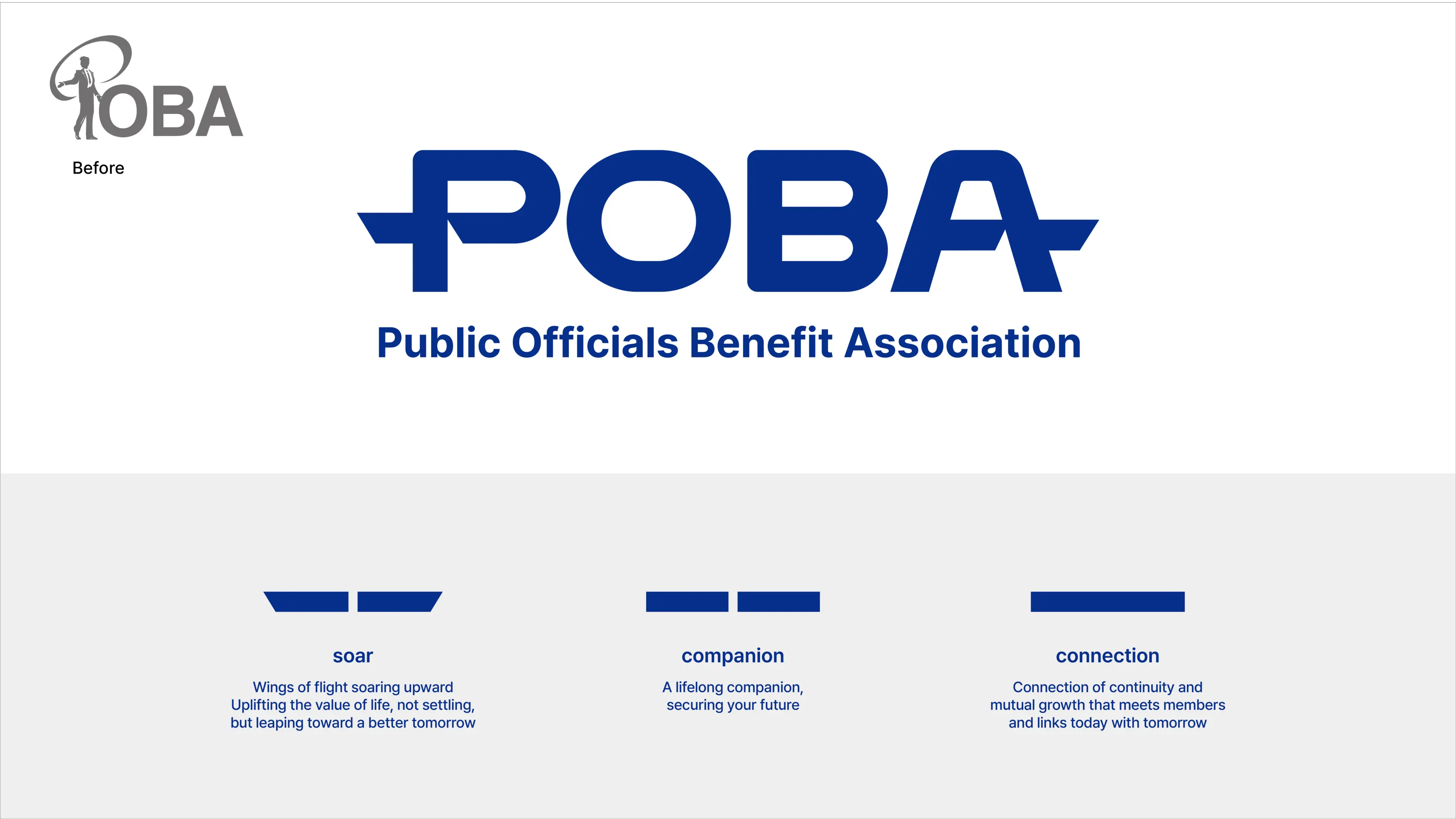
The Public Officials Benefit Association(POBA) is a financial institution marking its 50th anniversary, providing financial and welfare services to local government officials in South Korea. As a partner dedicated to enhancing the quality of life for its members, POBA’s values are symbolized through the motif of a “path(line)”. The continuous line signifies the close connection and companionship between POBA and its members. Additionally, the diagonally cut ends of the strokes evoke an image of upward movement, symbolizing soaring toward a better future. It is simple yet effectively communicates the core values.
The Jury‘s Statement
The consistent use of a continuous line gives »POBA« a distinctive visual identity that powerfully embodies closeness and continuity. Diagonally cut line ends symbolize progress and collective growth. The concept skilfully combines emotional resonance with clear direction, creating a charismatic brand presence. This implementation impresses with its strategic clarity and lasting impact—a gold-worthy achievement in brand development.