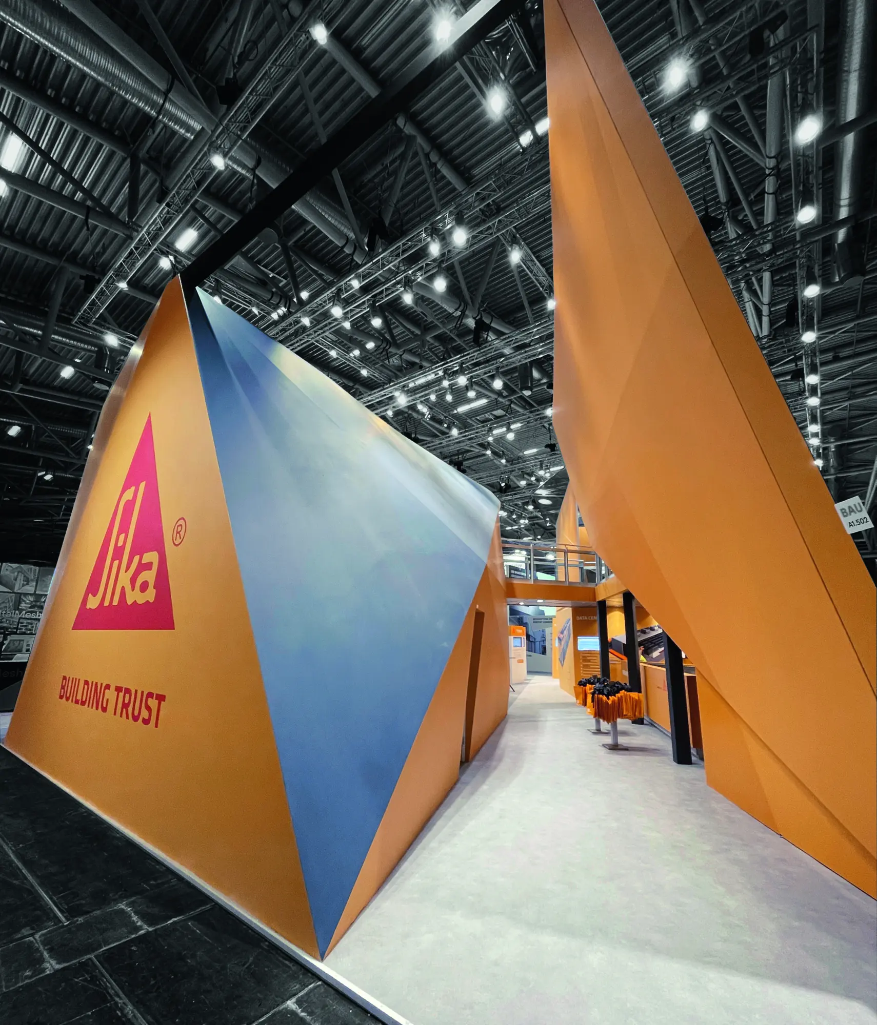
Messestand Sika
Winner
Excellent Architecture
Fair and Exhibition
Details
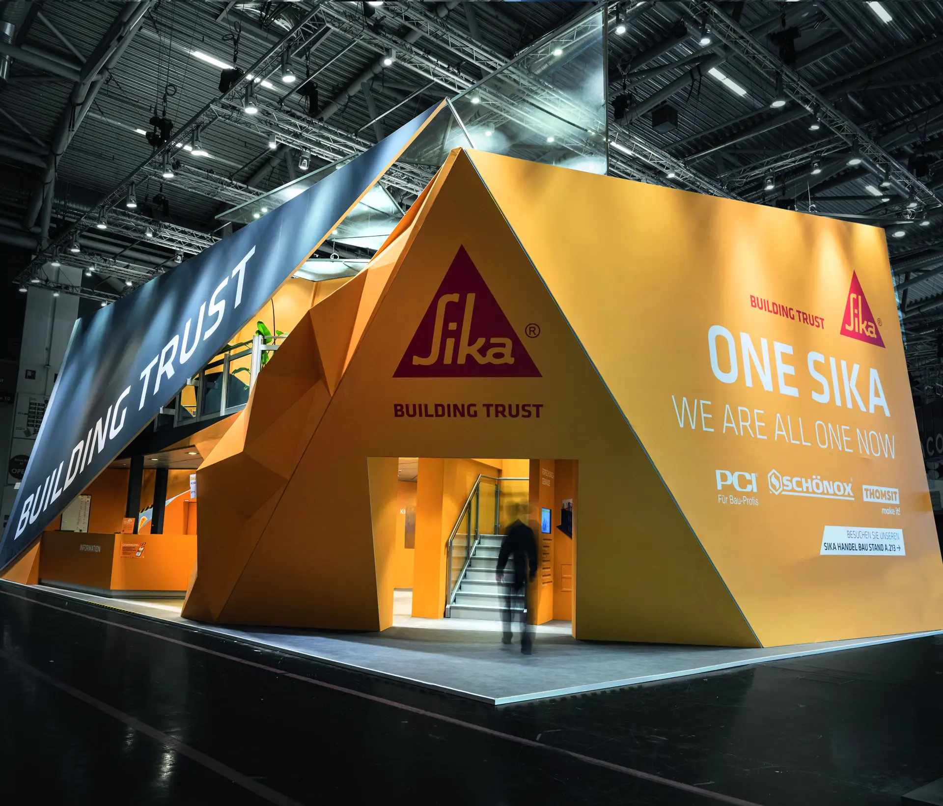
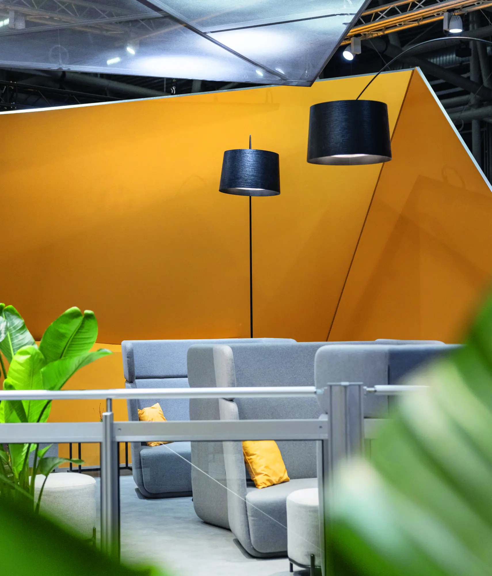
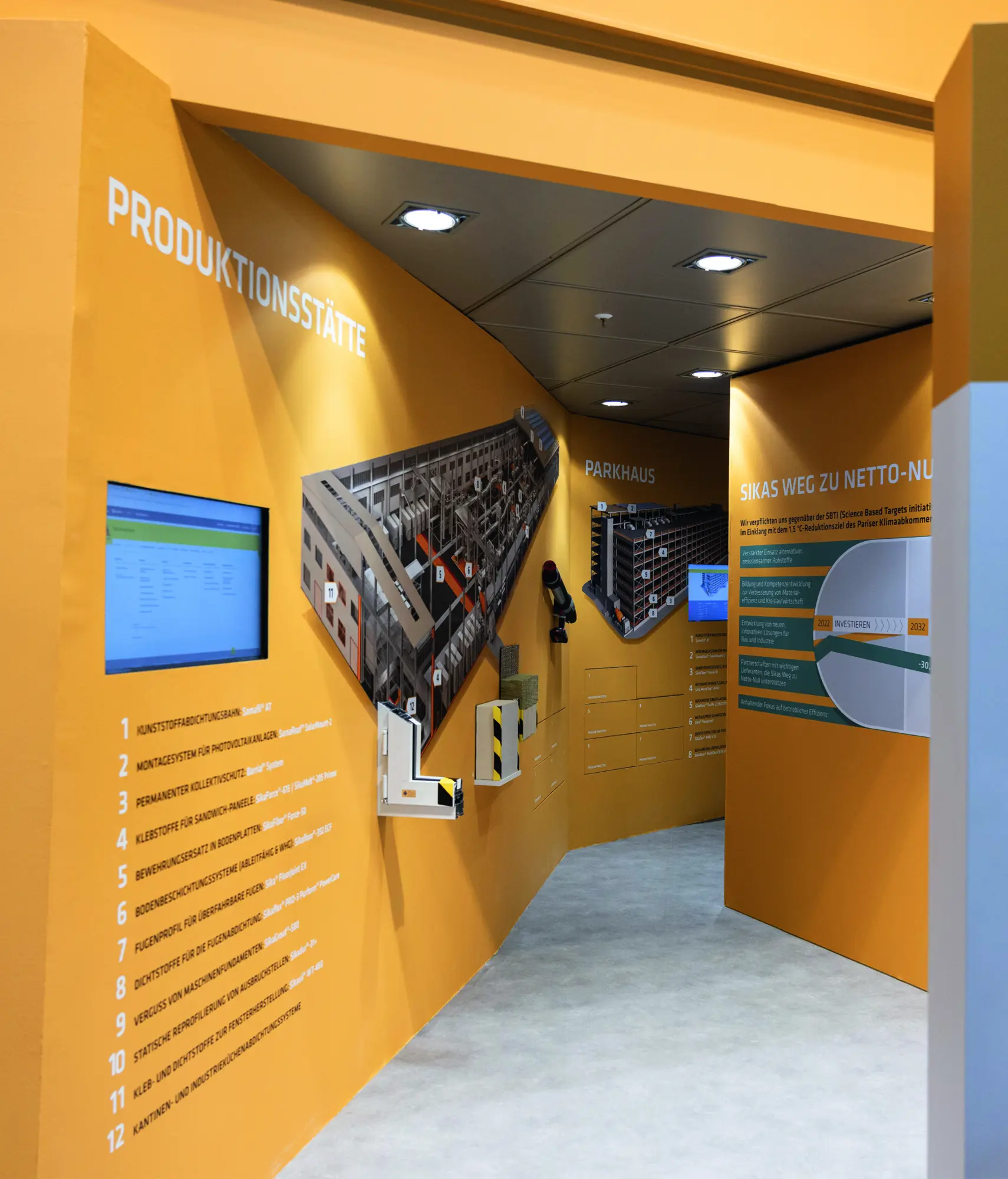
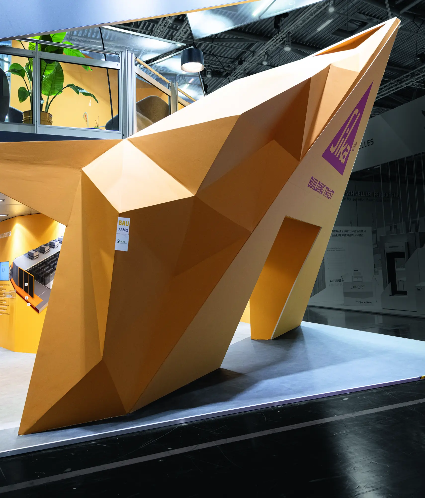
A booth concept under the motto "One Sika" was developed for the trade fair. The design is based on the triangular shape of the logo and the distinctive colour scheme, especially yellow. The stand offers two levels with different uses: an interactive product presentation for innovations and areas for conversations and networking. The clear design and consistent application of corporate identity—covering architecture, furniture, and staff—created a strong, recognizable visual identity at the trade fair.
The Jury‘s Statement
Character and brand identity merge in »Messestand Sika« to create an impressive spatial experience. The consistent triangular form, iconic yellow and differentiated zoning result in a harmonious, powerful overall impression. Particularly compelling: The confident translation of the corporate design into architecture, furnishings and detail establishes a pioneering presence within the exhibition context—exemplary for outstanding design at the highest level.