Barbara Hahn: Why Good Data Visualisation Doesn’t Start with Data
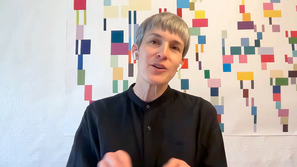
Who Is Designing for Whom?
Data is often considered the foundation of good decision-making. It is meant to provide orientation, reveal developments and make complex relationships understandable. In reality, however, the opposite often happens. The more information becomes available, the harder it is to keep track of it.
For Barbara Hahn, this is exactly where the role of communication design begins.
With her agency Hahn+Zimmermann, she has been working in the field of data visualisation for more than twenty years. Women in Politics emerged from an observation familiar to many designers: numbers are rarely the real problem. The real question is how people gain access to them.
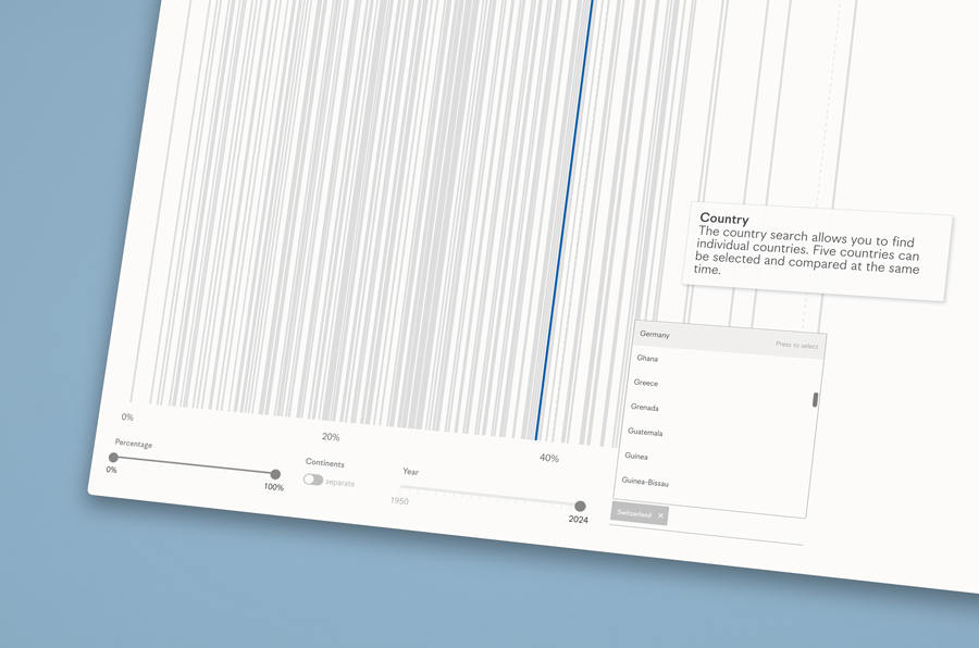
Over a period of five years, the team developed an international campaign that visualises the gender balance in parliaments across more than 190 countries. Behind the project was not only a socially relevant topic, but also a design challenge. “You need a question that comes from your own discipline, and you need relevant, engaging content.”
Most Visualisations Don’t Think Enough About Their Audience
When people talk about data visualisation, they often focus on chart types, colour systems or interactivity. Barbara Hahn starts with readers. “We always think very specifically about who our target audience is, who the intended audience is and who will ultimately read it.”
For her, the quality of a visualisation is determined at the beginning of the process, not at the end. Every audience comes with different expectations, different levels of prior knowledge and different attention spans.
“Keeping the audience in mind is essential. The real challenge is deciding how much information and how much complexity we want to ask our readers to engage with.”
The challenge, therefore, is not to show as much data as possible. It is to design the right level of complexity.

A Story Needs More Than One Channel
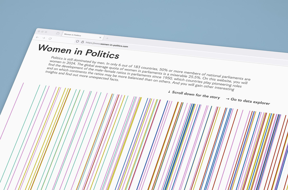
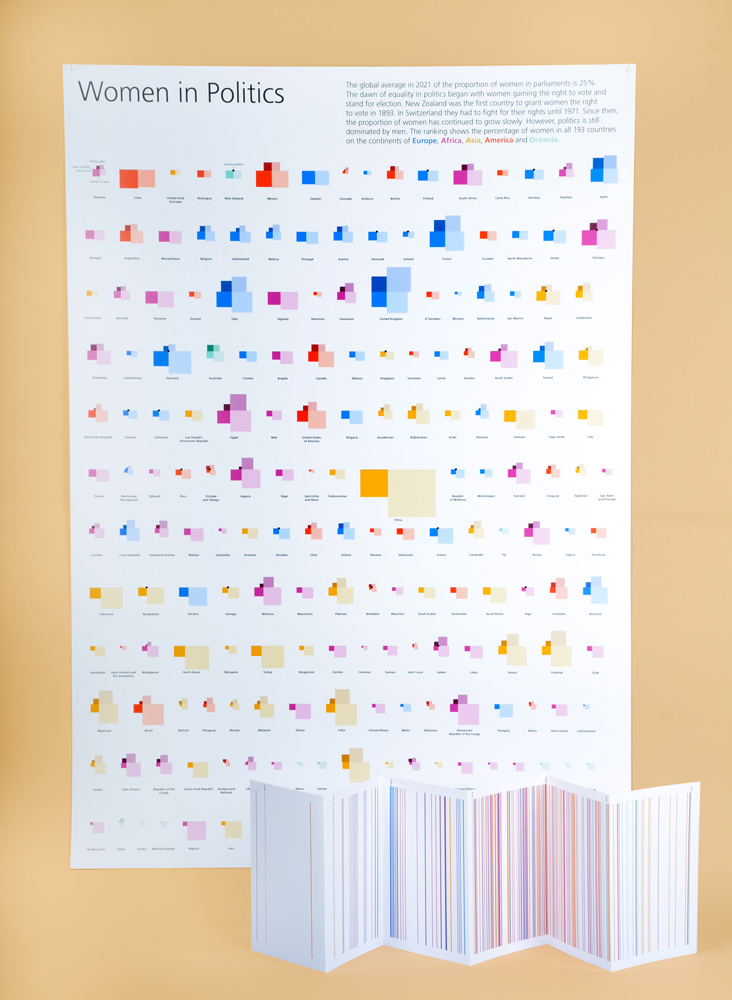
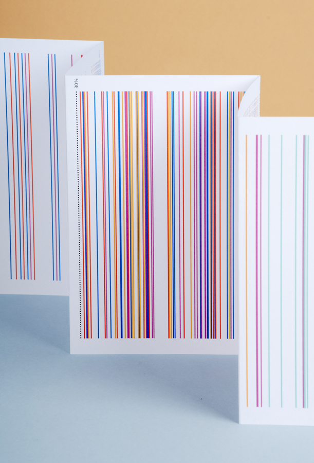
Information no longer reaches people in a single place. That is why Women in Politics was deliberately developed as a cross-media campaign. The data appears on an interactive website, in animations, in print and even as a graphic object in everyday life.
“One of the strengths of the project is that it reaches very different audiences across very different channels.”
At the same time, the visual identity remains consistent. “The key visual remains the same throughout the project. Only the storytelling formats change.” The insight behind this is remarkably simple: not every platform needs a new idea. But every platform needs its own way of telling the story.
Visibility Is Not Understanding
Many information graphics attract attention. Few create understanding. For Barbara Hahn, this is the key difference between design and communication.
“The idea is to create a very precise translation that results in a distinctive image, one that helps people see the data—and not only see it, but understand it.”
Data remains abstract. Design creates context. It helps people interpret relationships and recognise patterns that would otherwise remain hidden in tables or datasets. Only then does information become knowledge.
If You Don’t Understand the Content, You Can’t Design It
Perhaps this is the most important insight of the entire project. At a time when visualisations are often created within hours, Barbara Hahn advocates the opposite: slowing down.
“Only when I have understood the content as a designer am I able to translate it into a meaningful visual form.”
For her, design does not begin with form, but with understanding. First comes engagement with the content. Then comes the visual translation. Not the other way around. This perspective leads to a broader question: What role can communication design play in an increasingly data-driven world?
Barbara Hahn does not see designers as mere stylists. “I would encourage designers to really engage with unfamiliar content.” She believes the greatest potential lies where expertise meets public communication.
“How can we contribute value to other disciplines through our design perspective?”
Design becomes a bridge between expertise and accessibility. Ultimately, much of the discussion comes down to one question: What are we designing for?
For Barbara Hahn, the answer is clear. “Content and aesthetics should be considered equally.” Design loses its value when it remains purely surface-level. “We should not create superficial aesthetics that have nothing to do with the content.”
The strongest images emerge when form is developed directly from content. They spark curiosity, create orientation and stay in people’s minds. That is exactly what makes Women in Politics so relevant. The project does not simply visualise data about political representation. It shows how communication design can transform complex information into something people can genuinely understand. And perhaps that is more important today than ever.
Does Your Project Make Complex Topics Accessible?
Women in Politics demonstrates that communication design can do far more than present information in an appealing way. It creates orientation in an increasingly data-driven world. It makes complex issues understandable, opens up new perspectives and helps people make informed decisions.
These are exactly the kinds of projects recognised by the German Design Awards. The awards celebrate work that addresses relevant societal questions, develops new approaches to communication and demonstrates how design can make knowledge accessible.
If your project helps people understand complex topics, opens up new perspectives or reaches audiences through design, we look forward to your submission to the German Design Awards 2027.
Take the opportunity to present your work to an international jury and become part of a global network of design excellence.